How to Draw Scientific Diagrams That Explain
Scientific drawing — technical and schematic drawing — is the kind of figure that explains how something works: a gear train, an electrical circuit, a process flowchart, a cutaway of a mechanism. The bar is simple and brutal: after one glance, the reader should understand the thing better than they did before. This guide covers when a diagram is the right choice, the notation conventions that make one readable, how to work from measurements, and a worked example from brief to finished figure.
When a Diagram Beats a Render
Photorealistic renders and photographs look impressive, and they are often the wrong tool for explaining a mechanism. A diagram wins when the reader needs to understand relationships, not appearance.
Abstraction is the advantage. A schematic strips away surface, color, and perspective, so nothing competes with the logic — which gear drives which, where the current loops, which step decides. Standard symbols make the figure readable across languages: a resistor drawn the same way in Tokyo and Toronto needs no translation. Diagrams also survive reproduction — they print legibly in one color at small sizes, on paper or a projector, where a render turns to mud. And they are editable: a changed component is moved, not re-photographed.
A render earns its place when the question is spatial or contextual — how the parts fit inside the housing, what the assembly looks like assembled. The strongest figures often pair the two: a cutaway render for context, a schematic beside it for logic. When in doubt, ask what the reader should be able to do afterward; if the answer is "follow the logic," draw a diagram.
What Makes an Explanatory Diagram Work
- One clear subject. The figure shows one mechanism or process. Anything that does not serve it gets cut.
- Correct relationships. Gears mesh where they should, current flows the right way, the flowchart's decision branches go to the right places. A diagram that "looks like a circuit" but is wired wrong is worse than none.
- Clean schematic style. Flat, even line work, consistent symbols, minimal shading. Decoration fights comprehension.
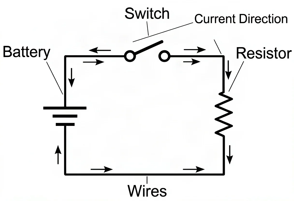
- Complete notation. Every part the reader needs to identify gets a label or a number, a scale reference where size matters, and a caption that states what the figure shows.
The Common Diagram Types
- Mechanical / cutaway — gears, assemblies, mechanisms, shown as cross-section or exploded view. Exploded views separate parts along an axis with leader lines tying each to its name.
- Electrical — circuits with standard symbols: battery, switch, resistor, lamp, wire. The convention is closed loops and labeled current direction.
- Process / flowchart — steps and decisions with standard shapes: rounded start/end, rectangular process, diamond decision, arrows showing sequence.
- Physical schematics — force vectors, field lines, ray optics, orbital paths — abstracting a real scene into the quantities that matter.
Each type carries its own symbol set, and following it is what lets a reader decode the diagram instantly instead of learning your personal notation first.
Notation Conventions: Labels, Numbering, Scale Bars
The notation layer is what turns a drawing into a reference figure, and it follows rules most technical fields share.
Leader lines are thin, straight or gently curved, and never cross each other or another label. They attach to the edge of the structure they name, with a small dot or touch rather than an arrowhead, and they point at one thing only. Labels sit outside the subject in a clean sans-serif, horizontally aligned where possible, right-aligned when stacked down one side. Numbering replaces labels when the figure is crowded: parts get numbers keyed to a legend beneath the figure, which is how old engraving plates handled dozens of structures without visual noise.
Scale bars state size honestly. "Actual size" dies at the photocopier; a drawn bar with its length labeled — 1 cm, 100 µm — survives any reproduction, so scientific convention is a bar, not a caption claim. Units and quantities appear on the axis or the component, never buried in the caption. And a consistent line-weight hierarchy — heavy for outlines, medium for parts, hairline for leaders and hatching — lets the eye sort structure from annotation without thinking.
Working from Measurements
A technical diagram is only as trustworthy as its proportions. When you can measure the real object, do: overall dimensions first, then the spacing of each component, then clearances. Record the numbers as you go — a sketch annotated in millimeters is a document; a sketch annotated from memory is a guess. Scale everything to the page with a single conversion factor and keep to it, so relationships survive even when absolute size does not.
When you cannot measure — a mechanism that exists only in a description, a process rather than an object — derive the proportions from the logic. A gear's radius sets its neighbors'; a flowchart's branch widths set the layout. State your basis in the caption ("proportions schematic"), so the reader knows what kind of accuracy to expect. Diagrams may simplify; they may not silently distort.

A Worked Example: The Gear Train
Suppose the brief is a teaching figure: "show how a three-gear train transmits rotation, and why the middle gear matters."
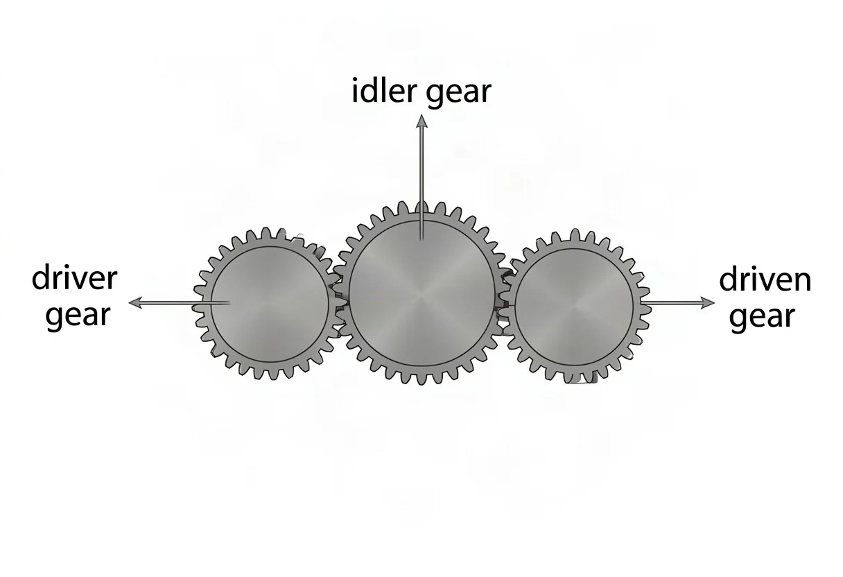
Draft one. Decide the single point — direction reversal through an idler — and choose the type: a flat mechanical schematic, gears as circles with teeth suggested, centers connected by dashed centerlines. Measure or assign the radii: driver small, idler medium, driven large, meshing at the pitch circles.
Check the logic. This is where drafts die. The driver turns clockwise; meshing reverses direction at each contact, so the idler runs counterclockwise and the driven gear clockwise. Add small curved arrows showing each rotation and a linear arrow at the pitch contact showing the shared tangential velocity. If the arrows disagree with the meshing, the figure is wrong regardless of how it looks — fix it before any rendering.
Draft two. Tighten the drawing to conventions: even line weight, consistent tooth pitch, number the gears 1–3 keyed to a legend (driver, idler, driven), and add the ratio statement as text beside the figure. Cut everything that does not serve the reversal story — no housing, no shaft detail, no shading.
Finish. Labels out, leader lines clean, caption written: "Fig. 1 — Three-gear train. The idler reverses rotation without changing the mesh ratio between driver and driven." Two error-checks happened in there — rotation directions and ratio labeling — and both were caught by reading the logic, not by looking at the picture. That habit is the whole craft.
Why Technical Diagrams Stay Plain — and How Accurate They Must Be
Because decoration competes with comprehension. Flat, even line work and standard symbols let a reader decode the figure instantly; shading and photorealism add noise without adding meaning. On accuracy: the logic has to be right. A circuit that does not loop, a gear train that cannot turn, a flowchart that dead-ends — no amount of style hides these failures. Get the relationships right first; rendering is secondary.
Can AI Draw Technical Diagrams?
For lesson figures and explainers, yes — describe the parts, the relationships, and the labels, and a model can produce a clean technical diagram quickly. The risk is logical error: gears that do not quite mesh, circuits that do not quite loop, flow that branches wrong. These look plausible while being wrong, so verify the relationships before using an AI diagram for instruction — the same read-the-logic check from the worked example above. For a quick explainer or concept draft, the speed is worth the verification step. For the wider field, see what scientific illustration is and our botanical illustration guide.
Try the scientific illustration generator → (technical mode)
FAQ
What is the difference between a scientific diagram and a regular drawing?
A scientific (technical) diagram exists to explain — it uses clean schematic style, standard symbols, correct relationships, and labels. A regular drawing can prioritize appearance. For a diagram, clarity and correctness outrank looks.
Do I need to understand the mechanism to draw it?
Yes — for the drawing to be accurate, you need the relationships: which gears drive which, how the circuit loops, what the flowchart decides. Style you can simplify; the logic has to be right before you draw.
What software is used for technical diagrams?
Publication figures are usually finished in vector software — Adobe Illustrator is the professional standard, and Inkscape is the free open-source equivalent — because vector lines stay crisp at any size. For drafts and lesson visuals, AI generators produce a labeled starting figure in seconds that you can trace or refine.
Can AI draw accurate technical diagrams?
For lesson figures and explainers, yes — describe the parts and labels. The risk is logical errors (gears not meshing, circuits not looping), so verify the relationships before using the diagram for instruction.