What Is Natural History Illustration?
Natural history illustration draws the living and physical world — ecosystems, rock strata, the water cycle, the solar system, the relationships between organisms. It is the format that filled 19th-century natural-history books, and a lot of modern work still borrows that look on purpose, because it reads as trustworthy and timeless. This guide covers what natural history illustration is, where the tradition came from, how its plates are composed, and where AI fits in.
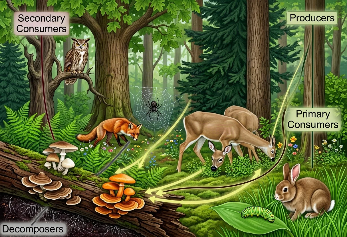
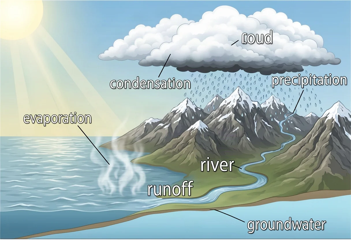
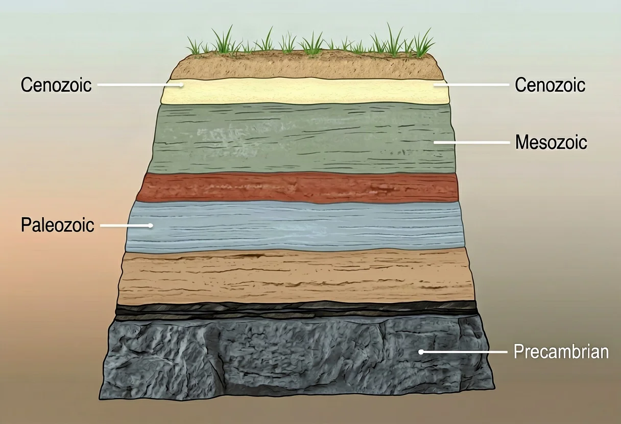
What Natural History Illustration Shows
Where botanical or zoological illustration zeroes in on one organism, natural history illustration most often shows processes and relationships — the things you cannot capture in a single specimen shot.
- Ecosystems and food webs — energy flow, who eats whom, producers and decomposers.
- Earth science — geological strata, the water cycle, rock cycles, cross-sections of terrain.
- Astronomy — the solar system, orbital mechanics, phases and eclipses.
- Composite scenes — a habitat with its key organisms arranged to show how they relate.
The uniting rule is the same as all scientific illustration: accuracy first, then clarity, then composition. Style — vintage or modern — is a layer on top of that order, not a substitute for it.
The Collecting Era: Where the Tradition Came From
The classic natural history plate is a product of the 18th and 19th centuries, when European expeditions brought back plants, animals, rocks, and fossils faster than anyone could describe them. Naturalists collected specimens into cabinets and holds; illustrators drew them, often from preserved material — a bird skin, a pressed plant, a shell — and engravers turned the drawings into printable plates for books that circulated the findings to people who would never see the tropics or the outback. Scientific societies and museums grew around exactly this exchange: specimen in, plate out, knowledge distributed.
That era set the visual vocabulary still in use. A habitat plate showing several species together, a stratigraphic cross-section, an annotated food web — all descend from a publishing tradition where one engraved sheet had to carry a whole argument, because the next sheet was expensive. The illustrators were often working scientists themselves, and the plates were data: readers measured them, compared them, and argued from them.
The Vintage Aesthetic
The classic 19th-century look comes largely from printing technology. Engravings and etchings built tone with fine, even hatching, because continuous-tone printing was not practical at scale. That constraint produced a style people now associate with authority and craft — fine parallel hatching instead of smooth shading; a sepia or limited palette; symmetric, composed layouts with labels and leader lines; decorative rules and borders that frame the plate like a document.
It still works because it signals "this was studied carefully," which is exactly the signal a natural history illustration wants to send. And because style is only the surface, a vintage-engraved plate can be as topologically correct as a modern one — careful science in a deliberate old style is the combination that makes the look effective rather than nostalgic.
Composition Conventions of a Natural History Plate
Old plates follow layout habits that modern illustrators still copy, because they solve real problems.
- A centered subject with generous margins. The main scene sits in the middle of the sheet, framed by white space, so the plate reads as a document rather than a crop.
- Multiple numbered figures on one sheet. Instead of one image, a plate often holds several related figures — a scene, plus enlarged details — numbered I, II, III and keyed to a caption. This is the era's version of "main figure plus callouts."
- A consistent ground line and horizon. Composite habitat scenes place organisms along a shared ground, which keeps wildly different species at believable relative scales.
- Directional cues for processes. Arrows and flow lines trace energy, water, or time; cyclical processes are drawn as loops, not sequences.
- Labels outside the subject. Leader lines run from clean sans-serif or engraved-serif names to the structure, never crossing each other.
When you compose your own plate, these conventions are the reason an old-looking layout reads as scientific rather than decorative.
How to Make a Natural History Plate
- Define the process or relationship you want to show — energy flowing through a forest, layers of rock oldest to youngest.
- List the components — organisms, layers, arrows — and cut anything that does not serve that one relationship.
- Arrange the layout following the conventions above: centered subject, numbered figures for details, a consistent ground line.
- Render in a consistent style — fine hatching and a limited palette for the vintage look, flat clean color for a modern one.
- Add directional cues (arrows, flow lines) so the process is followable.
- Label the parts and stages with leader lines.
- Check the science — the right number of trophic levels, the correct layer order, accurate orbital sequence.
Museums, Field Guides, and the Modern Revival
The tradition never really stopped; it moved. Museums and visitor centers still commission natural history illustration for interpretive panels, diorama backdrops, and exhibit graphics, where a composite labeled scene explains an ecosystem faster than any photo wall. Modern field guides inherited the composite-plate layout directly — many bird and insect guides arrange multiple species on one plate for direct comparison, exactly as 19th-century books did.
Two things have fueled the current revival. Digital archives — the Biodiversity Heritage Library among them — have put millions of historical plates online, free to study and reference, so the old work circulates far beyond rare-book rooms. And the aesthetic itself has become a design language for posters, packaging, and editorial illustration. The revival is good for accuracy as often as not: the best modern work keeps the old layouts and label discipline while updating the science underneath — a strata plate drawn today carries current era names and correct ordering in the same engraved dress its 1870s ancestor wore. For a curated look at where that style has gone, see our natural history vintage illustration collection.
If you want to practice the craft itself, start with the formats museums still commission: a habitat scene with named organisms, a cross-section with labeled layers, a cycle drawn as a loop. They are short projects with clear right answers, which makes them honest practice.
How Is It Different from Botanical or Zoological Illustration?
It overlaps, but the focus differs. Botanical and zoological illustration center on one organism's structure. Natural history illustration more often shows processes and relationships — ecosystems, cycles, habitats — across many organisms at once. The same accuracy-and-labels foundation applies; the scale and subject change. For the parent discipline, see what scientific illustration is, and for the style's gallery side, our vintage scientific illustration gallery.
Can AI Do Natural History Illustration?
Yes, and it handles the vintage engraving aesthetic well when you ask for it. Describe the process, the organisms, the labels, and the style — "19th-century engraving, fine hatching, limited sepia palette" — and a model can produce a clean natural history illustration in seconds. Verify the relationships before relying on it: the risk is a beautiful plate that is subtly wrong on the science — a trophic level missing, strata out of order, orbits misaligned. Style is the easy part for a model; the argument still needs your check.
Try the scientific illustration generator → (natural-history mode)
FAQ
What subjects count as natural history illustration?
Ecosystems and food webs, geological strata and cross-sections, cycles like water and rock, astronomy diagrams, and composite habitat scenes — anything where the subject is a process or a relationship rather than a single organism.
Why does vintage natural history illustration still look good?
The 19th-century engraving style — fine hatching, limited palette, careful composition — came from printing limits, but it reads as deliberate and authoritative. That is the tone the discipline wants, so the look endures.
How do I get a vintage look with AI?
Describe the style directly — "19th-century engraving aesthetic," "fine parallel hatching," "limited sepia palette" — along with the subject, the layout (centered, numbered figures, labels with leader lines), and the science you need shown.
Does the vintage style hurt accuracy?
No, as long as the underlying structure is correct. Style is decoration; accuracy lives in the proportions, relationships, and labels. A vintage plate can be as correct as a modern one.