What Is Scientific Illustration?
Scientific illustration is the discipline of drawing real subjects — a structure, a process, a relationship — accurately enough and clearly enough that a reader understands them better from the image than from the object itself or a photograph. It is the format behind textbook figures, museum panels, field guides, journal papers, and patient-education handouts, and two centuries of photographic progress have not replaced it.
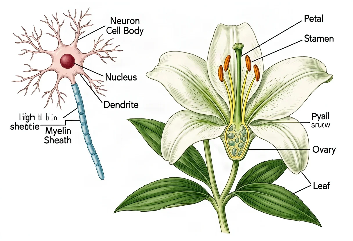
A photograph shows what something looked like from one angle, in one light, at one moment. Scientific illustration can combine several views on one sheet, strip away everything irrelevant, and add labels that name each part — which is why the camera never ended the job, and why nearly every science field still depends on drawn figures.
What Makes an Image "Scientific" Illustration?
Three things, consistently, separate scientific illustration from decorative drawing.
- Accuracy is the point. Structures are drawn true to the subject: correct counts, correct proportions, correct relationships. A plant with five petals is drawn with five, not "about five." Decoration comes second, or not at all.
- It explains. Composition, arrows, color coding, and labels are chosen to teach, not to impress. A scientific illustration that looks beautiful but misleads its reader has failed at its only job.
- It is verifiable. A scientific illustration is a claim about the subject — this is what it looks like, this is how it is built — and professional work is drawn from specimens, measurements, or established conventions precisely so the claim can be checked.
That third point is what gives the field its standing. An illustration in a flora or an anatomy atlas is treated like evidence: reviewed, corrected, and trusted exactly as far as it is accurate.
Scientific Illustration vs. Art vs. Photography
The three modes do different work, and the difference is about priority, not skill.
Photography captures one real moment. It is fast and literal, and it is unbeatable when the question is "what did this actually look like?" But it cannot isolate a structure from its background, place a bud, an open flower, and a fruit together at their true relative sizes, or label what it shows — and in many scientific subjects the key detail sits exactly where a photograph hides it, in deep shadow or behind other tissue.
Fine art prioritizes expression; accuracy is optional and often deliberately bent. Scientific illustration inverts the order: accuracy and clarity first, beauty as a welcome side effect. Much scientific illustration is genuinely beautiful — Hooke's engravings and Haeckel's plates hang on living-room walls today — but the beauty comes out of the clarity, never instead of it.
A Short History: From Micrographia to the Digital Plate
Scientific illustration is about as old as science publishing. When Robert Hooke's Micrographia appeared in 1665, its engraved flea — spread across a full page — let ordinary readers see the microscopic world for the first time. It set the pattern the field still follows: new instruments produce new observations, and carefully drawn plates carry those observations to people who will never look through the lens.
The 18th and 19th centuries were the great era, because exploration kept supplying subjects that had never been drawn. Maria Sibylla Merian sailed to Surinam and published her studies of insects and their host plants in 1705, putting life cycle and habitat on a single plate decades before that became standard practice. Ferdinand Bauer drew plants and animals on the Flinders expedition to Australia and coded their living colors with numbers on his pencil sketches, so the finished plates could be colored accurately years later, an ocean away from the specimen. John James Audubon's The Birds of America (1827–1838) pushed the life-sized plate to its physical limit, and Ernst Haeckel's Kunstformen der Natur (1899–1904) made the forms of radiolarians and jellyfish into some of the most reproduced images in science.
Photography arrived in the middle of that era, and the field adapted rather than disappearing. The camera took over documentation of specimens and scenes; illustration kept the jobs the camera could not do — reconstruction, combination, simplification, and labeling. In the 20th century the profession organized itself, with trained illustrators working beside researchers in museums, hospitals, and publishing houses, and the tools moved from copper engraving and lithography to watercolor, pen and ink, and eventually vector software. The newest chapter is generative AI, which changes the speed of drafting, not the standard of accuracy the work is judged by.
The Five Main Types of Scientific Illustration
The field divides into disciplines, each with its own conventions and all sharing the same foundation of accuracy, clarity, and labels.
Botanical illustration draws plants — the whole habit plus leaves, flowers, fruit, and dissections — for identification and record. Its center of gravity is diagnostic detail: the leaf margin, petal count, and flower structure that let a reader name the species. We go deeper in what botanical illustration is and the hands-on botanical illustration guide.
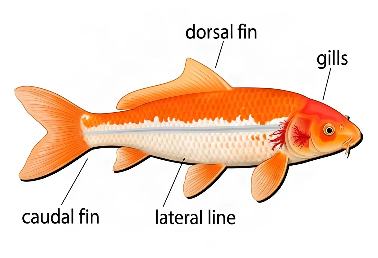
Zoological and wildlife illustration draws animals, from field-guide poses to full anatomical plates. The recurring jobs are species recognition (beak shape, fin count, scale rows) and structure teaching (skeletons, wing anatomy, life stages). Our guide to drawing animals walks the method.
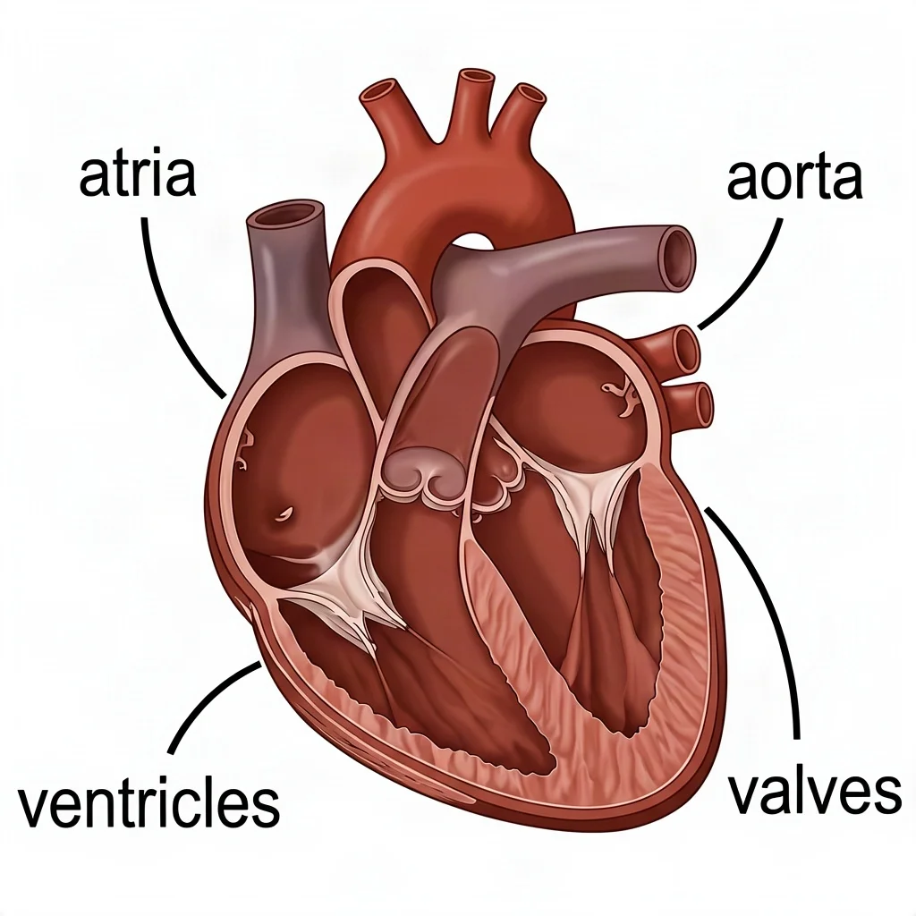
Medical and anatomical illustration draws the human body and clinical processes — organs in correct spatial relationship, surgical steps, cellular mechanisms — under the strictest accuracy bar in the field, with conventions like red arteries and blue veins. What medical illustration is covers that world.
Natural history illustration works at the scene and system scale: ecosystems, food webs, rock strata, the water cycle, and the composite habitat plates people associate with 19th-century books. What natural history illustration is covers its scope and its enduring vintage look.
Technical and schematic illustration explains mechanisms and processes — gear trains, circuits, flowcharts, cutaways — with standard symbols and flat, even line work. The scientific diagrams guide covers those conventions.
Where the Work Appears
Scientific illustration shows up in more places than most readers notice. Textbooks and university course materials lean on it because a labeled figure teaches structure faster than a page of prose. Journals and research papers use it for reconstruction and explanation — a fossil rebuilt, a method diagrammed, a process summarized. Museums and visitor centers commission interpretive panels where a photograph cannot isolate the story. Field guides are almost entirely illustrated, because a drawn plate can show a species' typical appearance while a single photo shows one individual on one day. Patient-education materials, surgical training visuals, legal exhibits, and conservation documents round out the list. Each use sets its own accuracy bar: a lesson figure must be correct where it teaches, while a published flora figure is checked structure by structure.
How Scientific Illustration Is Made
The traditional workflow is observation, sketching, refinement, and labeling, usually in graphite and watercolor or their digital equivalents. The illustrator studies the subject — often a real specimen — measures proportions, blocks in the composition, renders each structure for diagnostic accuracy, and finishes with labels and leader lines. That process still produces the most trusted results for publication, because every line passes through a person who looked at the reference and decided it was true.
It is also slow. A single careful plate can take hours to days, and much of what people actually need — lesson visuals, article art, presentation figures, concept drafts — does not justify that time. That gap is where digital tools and AI generators have changed practice: a draft plate in seconds, then human judgment on accuracy.
Can AI Do Scientific Illustration?
Yes, for drafts, education, and content — with verification. Describe the subject, the view, and the labels you want, and a model can produce a clean, labeled plate in seconds. Used this way, AI makes scientific illustration practical for classrooms, blogs, and early concepting at a speed hand rendering never could.
The limitation is that a generated image is plausible rather than verified. Petal counts, fin placement, or anatomical relationships can be subtly wrong while looking entirely right, so the workflow that works is generate, then check against a real reference. For published, checked work, professional illustrators remain the standard; AI is the fast first draft they correct.
Try the scientific illustration generator →
FAQ
Is scientific illustration art or science?
It is a craft in service of science. A scientific illustration can be beautiful, but if it is not true to the subject and does not explain it, it has failed its main job. Accuracy and clarity outrank expression.
Why use an illustration instead of a photograph?
An illustration can combine multiple views, remove distracting background, emphasize the key structure, and add labels — things a single photograph cannot do. For teaching a structure or process, that control matters more than literalness.
Do I need to draw well to make scientific illustrations?
Patience and observation matter more than raw drawing talent. Accuracy comes from looking carefully and rendering what is actually there, and digital tools and AI can carry much of the rendering once you know what must be depicted.
What do scientific illustrators study?
Most professionals train in both science and art — biology or anatomy coursework alongside drawing — and many hold degrees in scientific or medical illustration. The dual training is what lets them read a specimen and draw what matters in it.