<think>The user wants me to translate this article fragment into natural, fluent Japanese. Let me carefully translate while preserving all markdown syntax, URLs, image paths, and the brand name "GLMImage".
Let me translate:
"A coloring page looks like the simplest image to make and is one of the hardest to prompt."
→ 「塗り絵は、一見もっとも簡単に作れる画像に見えますが、実はもっともプロンプトが難しい画像の一つです。」
"The failure mode is always the same: the model sneaks in shading, the outlines get thin, and what prints is a gray smudge a crayon can't rescue."
→ 「失敗のパターンはいつも同じで、モデルが勝手に陰影をつけ始め、輪郭線が細くなり、印刷してもクレヨンでは救えない灰色の染みのような仕上がりになります。」
"Done right, an AI coloring page generator produces clean black line art with big open regions — printable, giftable, and endlessly remixable around whatever your kid is obsessed with this month."
→ 「うまく作れば、AI塗り絵ジェネレーターは、クリーンな黒の線画と大きな空白のある領域を生成し、印刷でき、贈り物にもでき、今月お子様が夢中になっているものに合わせて無限にリミックスできます。」
For the image alt text: "A clean children's coloring page of a friendly octopus"
→ 「友好的なタコのきれいな子供向け塗り絵」
Let me refine these to be more natural Japanese.</think>
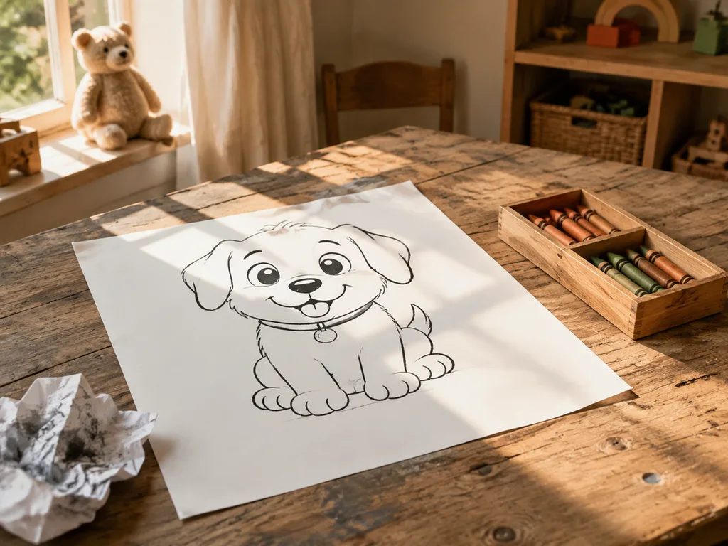
塗り絵は、一見もっとも簡単に作れる画像に見えますが、実はプロンプトを出すのがもっとも難しい画像の一つです。失敗のパターンもいつも同じで、モデルが勝手に陰影を描き始め、輪郭線が細くなり、印刷してみるとクレヨンでも救えない灰色のシミのような仕上がりになってしまいます。うまく作れば、AI塗り絵ジェネレーターは、黒い線画がくっきりしていて広々とした空白のある、すっきりとした線のアートを生成してくれます。印刷して配布できる、贈り物になる、今月お子様が夢中になっているテーマに合わせて無限にアレンジできる、そんな一枚が作れるのです。
<think>The user wants me to translate this English article fragment into natural, fluent Japanese. Let me translate it carefully while preserving all markdown syntax, URLs, and the brand name "GLMImage".
Let me translate each part:
"## What a printable coloring page actually needs" → "## 印刷用の塗り絵ページに本当に必要なもの"
"Three properties, all of them promptable:" → "3つの要素、すべてプロンプトで指定可能:"
-
"Thick, uniform black outlines. Thin lines break when printed at A4 and frustrate small hands." → "太く均一な黒の輪郭。 細い線はA4で印刷すると途切れ、小さな手には扱いにくい。"
-
"Zero shading, zero gray, zero color. Any tone is a bug — the child supplies the color." → "陰影なし、灰色なし、色なし。 どのような色調もバグ — 色を付けるのは子どもの役目。"
-
"Large closed regions. Open shapes and scattered detail color badly; big enclosed areas color well." → "大きく閉じた領域。 開いた形や散らばった細部は塗りにくく、大きく囲まれた領域は塗りやすい。"
"The printing standard is A4 at portrait, so generate in 3:4 or 2:3 and print 'fit to page.'" → "印刷の規格はA4縦向きなので、3:4または2:3で生成し、「フィットページ」で印刷してください。"
Let me double-check for natural Japanese expression:
- "promptable" - in this context, it means that these properties can all be specified via prompts. I'll use "プロンプトで指定可能" which is natural.
- "frustrate small hands" - this is about being difficult for small hands to use. "小さな手には扱いにくい" works well.
- "Any tone is a bug" - "どのような色調もバグ" - this is fine but maybe "色調があればすべてバグ" sounds slightly more natural.
- "the child supplies the color" - "色を付けるのは子どもの役目" or "色は子どもが塗る" - I'll use "色は子どもが付ける" or similar.
Let me refine:
Actually, "印刷の規格" might be better as "印刷条件" or "印刷形式". Let me think... "The printing standard" - 印刷の規格 or 印刷基準. I think 印刷基準 or 印刷形式 works.
Let me finalize:
"fit to page" - this is a printer setting. I'll keep it as "フィットページ" with quotes.
Final version looks good. Let me make sure I'm preserving all markdown exactly.</think>
印刷用の塗り絵ページに本当に必要なもの
3つの要素、すべてプロンプトで指定できます。
- 太く均一な黒の輪郭。 細い線はA4で印刷すると途切れてしまい、小さな子どもの手には扱いづらくなります。
- 陰影なし、灰色なし、色なし。 色調が少しでも入っていればそれはバグ — 色を付けるのは子どもの仕事です。
- 大きく閉じた領域。 開いた形や散らばった細部は塗りにくく、大きく囲まれた領域は塗りやすいです。
印刷の条件はA4縦向きなので、3:4または2:3のアスペクト比で生成し、「フィットページ」で印刷してください。
<think>The user wants me to translate a blog fragment from English to Japanese. Let me carefully follow the rules:
- Keep all markdown syntax intact
- Keep all URLs, image paths, and HTML tags exactly as-is
- Keep code blocks and inline code untranslated (but the prompt in quotes isn't a code block, so I should translate it... wait, let me re-read)
Looking again - the prompt is in quotes but not in a code fence. Rule 3 says "Keep code blocks and inline code untranslated". The prompt is not in a code block or inline code (no backticks), so I should translate it.
Actually, let me reconsider. The prompt contains English terms that might be technical/prescriptive. But the rules say to translate it into natural Japanese since it's not in a code block.
Let me translate this fragment:
The prompt that works
→ 機能するプロンプト / うまくいくプロンプト
The reliable formula is explicit negatives plus a medium reference:
→ 信頼できる式は、明示的なネガティブ指定と中程度の参照の組み合わせです:
"A children's coloring book page of [subject], thick clean black outlines, large simple shapes, pure white background, no shading, no gray tones, no color fills — line art only, in the style of a classic printed coloring book."
→ 「[被写体]の子供向け塗り絵ページ、太くてきれいな黒い輪郭、大きくてシンプルな形状、純粋な白背景、陰影なし、灰色なし、色の塗りつぶしなし — 線画のみ、古典的な印刷塗り絵のスタイルで。」
The medium reference matters. "Coloring book page" pulls the model toward real coloring-book training imagery; "black and white drawing" drifts into sketchy illustration with hatching — the gray-mess failure mode.
→ 媒体の参照が重要です。「塗り絵ページ」は実際の塗り絵の学習画像にモデルを引き寄せます;「白黒の絵」は hatching(陰影線)のあるスケッチ風のイラストに流れ込みます — 灰色のごちゃごちゃした失敗パターンです。
Image alt text: "A dinosaur coloring page with bold outlines"
→ 画像altは日本語化するか、そのままにするか... ルール2はURL、画像パス、HTMLタグをそのままにすることを言っています。alt属性のテキストは画像の一部なので... alt内のテキストは通常翻訳対象ですが、ルール2の解釈次第。安全策として翻訳します。
Actually, looking at the rule again: "Keep every URL, image path, and HTML tag EXACTLY as-is. Do not translate or alter them." This refers to URLs and paths themselves. Alt text inside HTML tags - it's ambiguous. But since the alt text describes the image content, it's typically translated for localization. I'll translate the alt text.
Let me refine my translation:
機能するプロンプト
信頼できる式は、明示的なネガティブ指定と中程度の参照の組み合わせです:
「[被写体]の子供向け塗り絵ページ。太くてきれいな黒い輪郭、大きくてシンプルな形状、純粋な白い背景、陰影なし、グレーのトーンなし、色の塗りつぶしなし — 線画のみ、古典的な印刷塗り絵のスタイル」
媒体の参照が重要です。「塗り絵ページ」と指定すると、モデルは実際の塗り絵の学習画像に引き寄せられます。一方「白黒の絵」と指定すると、スケッチ風で hatching(陰影線)の入ったイラストに流れ込んでしまい — 灰色でごちゃごちゃになる失敗パターンに陥ります。
Let me make this more natural Japanese:
機能するプロンプト
信頼できるコツは、明示的なネガティブ指定とメディアの参照を組み合わせることです:
「[被写体]の子供向け塗り絵ページ。太くきれいな黒い輪郭、大きくてシンプルな形状、純粋な白い背景、陰影なし、グレーのトーンなし、色の塗りつぶしなし — 線画のみ、定番の印刷塗り絵スタイルで」
メディアの参照が重要です。「塗り絵ページ」と指定すれば、モデルは実際の塗り絵の学習画像に引き寄せられます。一方、「白黒の絵」では hatching(陰影線)のあるスケッチ風のイラストに流れ込んでしまい、灰色でごちゃっとした失敗パターンに陥ります。
This looks good. Let me finalize.</think>
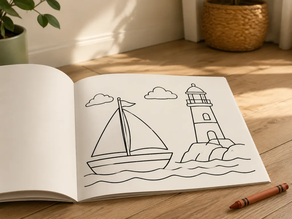
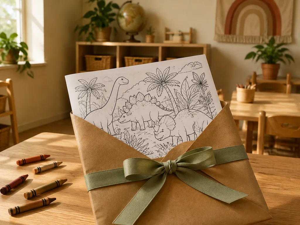
機能するプロンプト
信頼できるコツは、明示的なネガティブ指定とメディアの参照を組み合わせることです:
「[被写体]の子供向け塗り絵ページ。太くきれいな黒い輪郭、大きくてシンプルな形状、純粋な白い背景、陰影なし、グレーのトーンなし、色の塗りつぶしなし — 線画のみ、定番の印刷塗り絵スタイルで」
メディアの参照が重要です。「塗り絵ページ」と指定すれば、モデルは実際の塗り絵の学習画像に引き寄せられます。一方、「白黒の絵」では hatching(陰影線)のあるスケッチ風のイラストに流れ込んでしまい、灰色でごちゃっとした失敗パターンに陥ります。
<think>The user wants me to translate an English article fragment into Japanese. Let me carefully translate it while following all the rules.
The fragment is about name coloring pages generated by AI (GLMImage). I need to:
- Keep markdown syntax intact
- Keep URLs and image paths exactly as-is
- Keep "GLMImage" untranslated
- Use natural, fluent Japanese
- Output only the translated markdown
Let me translate:
Title: "Name coloring pages: the gift that prints"
- 名前ぬりえページ:印刷できるプレゼント
Paragraph 1: "The most-loved variant is personal: a child's name turned into a coloring page — letters big enough to color, each letter decorated with things they love. Prompt: 'a large name banner coloring page with the letters outlined thick and hollow for coloring, decorated with [dinosaurs and leaves], white background, line art only.'"
- 一番人気のバリエーションは、パーソナルなものです。子どもの名前がぬりえページになったもの — coloring できるくらい大きな文字で、それぞれの文字に好きなものが描かれているものです。プロンプト:「a large name banner coloring page with the letters outlined thick and hollow for coloring, decorated with [dinosaurs and leaves], white background, line art only.」
Wait, I should keep the prompt in English since it's a code/inline element. Actually, looking at the rules, I should keep code-like elements untranslated. The prompt is in quotes but not in code formatting. Let me keep it as-is since it's a technical prompt example. Actually, looking more carefully, it might be better to translate the surrounding text but keep the prompt as-is since it's a technical example.
Paragraph 2: "One honest caveat: text rendering. Short names usually render correctly with text-capable models; longer names may come out with a wrong letter. Always proofread before printing, and if a letter fails, regenerate just that page — or add the name yourself in any editor with a bubble font, which is bulletproof and takes two minutes."
- ひとつ正直にお伝えしなければならない注意点があります:テキストのレンダリングについてです。短い名前は通常、テキスト対応モデルで正しくレンダリングされますが、長い名前は一文字間違って出力されることがあります。印刷の前には必ず校正し、文字がうまく描けなかった場合は、そのページだけ再生成してください。あるいは、エディターでバブルフォントを使って自分で名前を追加するのも確実で、2分程度で済みます。
Image: Keep as-is with alt text possibly translated. The alt text is "A name banner coloring page with decorated letters" - I should translate this.
Let me put it all together:</think>
名前ぬりえページ:そのまま印刷できるプレゼント
一番人気があるのは、パーソライズされたバージョンです。子どもの名前をぬりえページにしたもので、文字は大きく塗りやすく、それぞれの文字にはその子が好きなものが描かれています。プロンプト:「a large name banner coloring page with the letters outlined thick and hollow for coloring, decorated with [dinosaurs and leaves], white background, line art only.」
ひとつ正直にお伝えしたい注意点があります。それはテキストのレンダリングについてです。短い名前は通常、テキスト対応モデルで正しく描画されますが、長い名前は一文字違って出力されてしまうことがあります。印刷の前には必ず校正し、もし一文字でも失敗していたら、そのページだけを再生成してください。または、エディタでバブルフォントを使って自分で名前を追加する方法もあります。これなら確実で、2分程度で済みます。
<think>The user wants me to translate this article fragment about coloring book themes into natural, fluent Japanese. Let me carefully translate it while keeping all markdown syntax intact.</think>
繰り返し使えるテーマ
動物+動きの組み合わせは、単純な動物よりも効果的です。「お茶会をするタコ」「スクーターに乗るハリネズミ」など。2〜4個の要素を含むシーンは、単一の被写体よりも子どもの注意を長く引きつけます。季節ごとのパック——新学期、ハロウィン、冬の祝日——は、教師や学級委員の保護者が実際にまとめて探すものです。
年齢調整はプロンプトの一語で済みます。「toddler(幼児)」を使えば、ずんぐりした非常にシンプルな形になりますし、「ages 6–8(6〜8歳)」と指定すれば、より詳細なエリアが描かれます。「tween(10代前半)」なら、パターンや曼荼羅風の密度にも対応できます。
<think>The user wants me to translate an article fragment from English to Japanese. Let me carefully translate it while keeping all markdown syntax intact, URLs unchanged, and maintaining natural fluent Japanese.
Let me translate:
Classroom and party use
A class set is the killer app: 24 kids, one theme, each page slightly different. Generate 6–8 pages per theme, print a stack, done. For birthday parties, theme pages to the cake design or the party's animal mascot — paired with a coloring table, it buys you twenty quiet minutes.
Road-trip packets, restaurant kits, and rainy-day folders work the same way: generate once, print many. Laminating one set with dry-erase markers turns a printed page into a reusable activity.
Translation:
教室やパーティーでの活用
クラス全員分を一括作成するのが最大の使いどころです。24人の子どもたちに同じテーマで、それぞれ少しずつ違うページを。テーマごとに6〜8ページを生成して、一括印刷すれば完了です。誕生日パーティーには、ケーキのデザインやパーティーの動物マスコットに合わせたテーマページを用意しましょう。塗り絵コーナーと一緒に使えば、静かな20分間を確保できます。
ロードトリップ用のプリントセット、外食先で使えるキット、雨の日のフォルダも使い方は同じです。一度生成して、たくさん印刷します。1セットをラミネートしてホワイトボードマーカーを使えば、印刷ページが再利用可能なアクティビティに早変わりします。
Let me refine this to sound more natural in Japanese:
「killer app」= 最高の活用法 / キラーアプリ
「buys you twenty quiet minutes」= 静かな20分を与えてくれる
Let me adjust:
教室やパーティーでの活用
クラス全員分を用意するのが最高の活用法です。24人の子どもたちに同じテーマで、それぞれ少しずつ違うページを。テーマごとに6〜8ページを生成して、一括印刷すれば完了です。誕生日パーティーには、ケーキのデザインやパーティーの動物マスコットに合わせたテーマページを。塗り絵コーナーと一緒に用意すれば、静かな20分間が手に入ります。
ロードトリップ用のプリントセット、外食先で使えるキット、雨の日のフォルダも使い方は同じです。一度生成して、たくさん印刷するだけ。1セットをラミネート加工してホワイトボードマーカーを使えば、印刷ページがくり返し使えるアクティビティに変わります。
This sounds natural. Let me finalize.</think>
教室やパーティーでの活用
クラス全員分を用意するのが一番の活用法です。24人の子どもたちに同じテーマで、それぞれ少しずつ違うページを。テーマごとに6〜8ページを生成して、一括印刷すれば完了です。誕生日パーティーには、ケーキのデザインやパーティーの動物マスコットに合わせたテーマページを。塗り絵コーナーと一緒に用意すれば、静かな20分間が手に入ります。
ロードトリップ用のプリントセット、外食先で使えるキット、雨の日のフォルダも使い方は同じです。一度生成して、たくさん印刷するだけ。1セットをラミネート加工してホワイトボードマーカーを使えば、印刷ページがくり返し使えるアクティビティに早変わりします。
<think>The user wants me to translate a blog fragment into natural, fluent Japanese. Let me carefully translate while following all the rules:
- Keep markdown syntax intact
- Keep URLs exactly as-is
- Keep code blocks untranslated (none here)
- Keep "GLMImage" untranslated
- Natural Japanese expression
- Output only translated markdown
Let me translate:
"## From coloring page to keepsake" → "## 塗り絵から記念品へ"
"The finished, colored page can go one step further: photograph it and restyle it — "turn this child's colored drawing into a soft watercolor illustration keeping every color choice" — for a printable keepsake."
→ "完成した塗り絵は、さらに一歩進めることができます。写真を撮ってスタイルを変更し、「子どもが塗った絵を、使われている色を残したまま柔らかな水彩イラストに変換」することで、印刷可能な記念品を作れます。"
"The editing models handle this well; it's the same machinery as the photo-to-painting workflows, pointed at crayon art."
→ "編集モデルはこの処理を得意としています。これは写真を絵画に変換するワークフローと同じ仕組みで、対象がクレヨンアートになっただけです。"
"Grandparent gifts, end-of-year teacher cards, the front of a memory box."
→ "おじいちゃんおばあちゃんへのプレゼント、年末の先生へのカード、思い出箱の表紙などに活用できます。"
"For older kids drifting from coloring to drawing, anime character generation is the natural next stop — same prompt-thinking, more style control."
→ "塗り絵から徐々に自分で描くことに移行している年長のお子さんには、アニメキャラクター生成が自然な次のステップです。プロンプトの考え方は同じで、より細かなスタイル調整が可能になります。"
Let me refine this for naturalness.</think>
塗り絵から記念品へ
完成した塗り絵は、さらに一歩進めることができます。写真を撮ってスタイルを変換し、「子どもが塗った色をそのまま残しながら、柔らかな水彩イラストに変換」することで、印刷できる記念品に仕上げられます。編集モデルはこの用途にもしっかり対応しており、基本の仕組みは写真を絵画に変換するワークフローと同じで、対象がクレヨンアートになっただけです。おじいちゃんおばあちゃんへのプレゼント、年末に先生へ渡すカード、思い出箱の表紙など、さまざまな場面で活用できます。
塗り絵から少しずつ自分で描くことに移行してきた年頃の子どもたちには、アニメキャラクター生成が自然な次のステップです。プロンプトの組み立て方は同じで、スタイルのコントロールがより細かくできます。
<think>The user wants me to translate a fragment of an article into natural, fluent Japanese. This is a fragment about a "Print checklist" related to a coloring page generator for GLMImage. Let me translate it carefully while preserving all markdown syntax, URLs, and formatting.
Let me translate:
Print checklist
- This should be a heading, kept as markdown
- Generate at 1024px-class or larger; A4 needs the headroom.
- Zoom to 100% and check for gray patches before printing.
- Print "fit to page," portrait, on standard paper — cardstock for markers.
- Keep the prompt in a note; the follow-up pack is one edit away.
Try the coloring page generator → — thick outlines, white background, printable by default.
Let me translate into natural Japanese:
印刷チェックリスト
- 1024pxクラス以上のサイズで生成する(A4は余裕が必要)。
- 100%にズームして、印刷前にグレーの斑がないかをチェック。
- 「フィット to ページ」で縦向き、標準用紙に印刷(マーカー用の場合は厚紙)。
- プロンプトをメモに残しておく(追加パックはあと一編集で利用可能)。
塗り絵ページジェネレーターを試す → — 太い輪郭線、白背景、初期設定で印刷可能。
Wait, "フィット to ページ" is mixed Japanese-English which is common in Japan, but maybe I should make it more natural. Let me reconsider.
Actually, in Japanese printing context, "フィット to ページ" or just using the English phrase is common. Or I could say "ページに合わせる" but that loses the specific print setting feel.
Let me refine:
印刷チェックリスト
- 1024px以上のサイズで生成する。A4で印刷する場合は余白が必要。
- 100%にズームして、印刷前にグレーのムラがないか確認する。
- 用紙に合わせて印刷(フィット to ページ)、縦向き、標準用紙に印刷。マーカーを使うなら厚紙を。
- プロンプトはメモに残しておこう。追加パックはあと一編集で完成する。
塗り絵ページジェネレーターを試す → — 太い線、白背景、印刷向けに最適化済み。
Let me think again about naturalness:
"Generate at 1024px-class or larger" - 「1024pxクラス以上のサイズで生成」
"A4 needs the headroom" - 「A4には余裕(ヘッドルーム)が必要」
"Zoom to 100% and check for gray patches before printing" - 「100%にズームして、印刷前にグレーの斑点がないか確認」
"Print 'fit to page,' portrait, on standard paper — cardstock for markers" - This is a bit tricky. It seems like it's saying print with "fit to page" setting, portrait orientation, on standard paper. The cardstock note is for when using markers.
"Keep the prompt in a note; the follow-up pack is one edit away" - 「プロンプトをメモに残しておく。追加パックはあと一編集で完成する」
Let me try again with more natural Japanese:
印刷チェックリスト
- 1024pxクラス以上のサイズで生成する。A4には余裕が必要。
- 100%にズームして、印刷前にグレーのムラがないか確認する。
- 「用紙に合わせる(フィット to ページ)」で縦向き、標準用紙に印刷。マーカーを使うなら厚紙で。
- プロンプトはメモに残しておこう。追加パックはあと一編集で完成する。
塗り絵ページジェネレーターを試す → — 太い線、白背景、印刷向けに最適化済み。
Actually, I think the original "the follow-up pack is one edit away" means the follow-up pack (of coloring pages presumably) is just one edit away from being created. So my translation captures that.
Let me finalize:
印刷チェックリスト
- 1024pxクラス以上のサイズで生成する。A4には余裕が必要。
- 100%にズームして、印刷前にグレーのムラがないか確認する。
- 「ページに合わせる」で縦向き、標準用紙に印刷。マーカーを使うなら厚紙を使用。
- プロンプトはメモに残しておこう。追加パックはあと一編集で完成する。
塗り絵ページジェネレーターを試す → — 太い線、白背景、初期設定で印刷可能。
Hmm, "by default" can be translated as 「初期設定で」or 「デフォルトで」. Both are fine. Let me go with 「初期設定で」for a more natural Japanese feel.
Actually, looking again, "printable by default" means the generator produces output that's ready to print. So:
「太い線、白背景、デフォルトで印刷に対応」
or
「太い線、白背景、初期設定で印刷可能」
Both work. I'll use the latter.
Let me check the URL - it should remain unchanged: /general/image-generation?mode=coloring-page
Final translation:
印刷チェックリスト
- 1024pxクラス以上のサイズで生成する。A4には余裕が必要。
- 100%にズームして、印刷前にグレーのムラがないか確認する。
- 「ページに合わせる」で縦向き、標準用紙に印刷。マーカーを使うなら厚紙に。
- プロンプトはメモに残しておこう。追加パックはあと一編集で完成する。
塗り絵ページジェネレーターを試す → — 太い線、白背景、初期設定で印刷可能。
This looks good. Let me do a final review of naturalness and accuracy:
- "Generate at 1024px-class or larger; A4 needs the headroom." → 「1024pxクラス以上のサイズで生成する。A4には余裕が必要。」- Good.
- "Zoom to 100% and check for gray patches before printing." → 「100%にズームして、印刷前にグレーのムラがないか確認する。」- Good.
- "Print 'fit to page,' portrait, on standard paper — cardstock for markers." → 「『ページに合わせる』で縦向き、標準用紙に印刷。マーカーを使うなら厚紙に。」- Good.
- "Keep the prompt in a note; the follow-up pack is one edit away." → 「プロンプトはメモに残しておこう。追加パックはあと一編集で完成する。」- Good.
The call-to-action: "Try the coloring page generator → ... — thick outlines, white background, printable by default." → 「塗り絵ページジェネレーターを試す → ... — 太い線、白背景、初期設定で印刷可能。」- Good.
I think this is good. Let me output it.</think>
印刷チェックリスト
- 1024pxクラス以上のサイズで生成する。A4には余裕が必要。
- 100%にズームして、印刷前にグレーのムラがないか確認する。
- 「ページに合わせる」で縦向き、標準用紙に印刷。マーカーを使うなら厚紙に。
- プロンプトはメモに残しておこう。追加パックはあと一編集で完成する。
塗り絵ページジェネレーターを試す → — 太い線、白背景、初期設定で印刷可能。
<think>The user wants me to translate this FAQ section into natural Japanese while preserving all markdown syntax, URLs, brand names, and code blocks. Let me translate each question and answer carefully.</think>
よくある質問
ページが影付きで出てきたのはなぜですか?
プロンプトから「媒体アンカー」が抜け落ちています。「coloring book page, line art only, no shading, no gray(塗り絵のページ、線のみ、影なし、灰色なし)」をもう一度加えてください。また、「sketch(スケッチ)」や「drawing(ドローイング)」という言葉は陰影やハッチングを引き寄せやすいので避けてください。
AIが子どもの名前を正しく綴ってくれますか?
短い名前であれば、テキスト描画モデルでは基本的に大丈夫です。ただし一文字ずつ必ず確認してください。もし一文字でも誤っていれば、エディタで吹き出し風のフォントに差し替えるのが手っ取り早いです。2分あれば確実にできます。
おすすめの紙はありますか?
クレヨンや鉛筆には通常の80gsm紙、マーカーには厚口のカードストックがおすすめです。薄い紙はマーカーのインクでにじんでしまいます。
教室や小さなショップでの使用に問題はありませんか?
有料プランの出力は透かしなしで商用利用が可能です。教室での使用は問題ありません。塗り絵パックを販売する場合は、セット全体でプロンプトを統一し、販売プラットフォームのAIに関する開示ルールを確認してください。
テーマ別の10ページセットはどう作ればいいですか?
スタイルの文章(「thick clean black outlines, line art only, white background(太くきれいな黒い輪郭線、線のみ、白い背景)」)を固定し、ページごとに被写体の文章だけを変えてください。10ページが1冊の本のように見えるのは、この共通スタイル文のおかげです。