<think>The user wants me to translate an article fragment about AI poster design into natural, fluent Japanese. Let me carefully translate this while keeping all markdown syntax, URLs, and the brand name "GLMImage" intact.
Let me translate this carefully:
- "A poster has one job: make someone walking past stop." → ポスターの役割は一つだけ。通りすがりの人を立ち止まらせること。
- "Good poster design nails three things before anything else — a focal image, a readable headline, and visual hierarchy that pulls the eye in the right order." → 優れたポスターデザインは、まず何より先に3つの要素を完璧に押さえます。すなわち、メインとなる画像、読みやすいヘッドライン、そして正しい順序で視線を誘導する視覚的階層です。
- "AI poster generators handle the craft; you still need the ideas." → AIポスター生成ツールが制作技術を担当しますが、アイデアはやはり人間の力が必要です。
- "This is a working set of both: directions that consistently produce strong posters, and the prompts that get them out of the model." → 本記事は、その両方をまとめた実用的なセットです。強力なポスターを安定して生み出すためのディレクションと、それをAIから引き出すためのプロンプトを紹介します。
Image alt text: "A wall of varied event and marketing posters" → イベントやマーケティングの多様なポスターが並ぶ壁
Let me finalize the translation.</think>
ポスターの役割は一つだけ。通りすがりの人の足を止めさせることです。優れたポスターデザインは、他の何よりも先に3つの要素を完璧に押さえます。すなわち、メインとなる画像、読みやすいヘッドライン、そして正しい順序で視線を誘導する視覚的階層です。AIポスター生成ツールが制作技術を担当してくれますが、アイデアはやはり人間の力が必要です。本記事は、その両方をまとめた実用的なセットです。強力なポスターを安定して生み出すためのディレクションと、それをAIから引き出すためのプロンプトを併せて紹介します。
<think>The user wants me to translate an article fragment about GLMImage from English to Japanese. Let me translate it naturally and fluently while keeping all markdown syntax, URLs, and brand names intact.
Key elements to preserve:
- Heading "What makes a poster work in 2026"
- URL: /ai-images/commercial-poster-generator
- Brand: GLMImage (already not present in this fragment, but I should be aware)
- Markdown formatting: bold (not present), but heading structure
- The casual but professional tone
Let me translate:
"What makes a poster work in 2026" → 2026年にポスターを成功させる要素
The content discusses Swiss design principles and how AI has changed poster design workflow. I should keep it natural and fluent in Japanese while preserving the professional blog tone.
Let me draft:
2026年にポスターを成功させるもの
スイスのデザインを支配していた原則は今も有効です。ポスター1枚につき1つのアイデア、5メートル離れて読める十分なコントラスト、2秒で把握できるタイポグラフィの階層。変わったのは制作方法です。無料のAIポスター生成ツールは、たった一文からイメージ・レイアウト・見出しのレタリングまでを含めたポスター全体を下書きします。これにより、ポスターデザインはレイアウトの作業からアートディレクションの作業へと変わりました。
実務面での変化:時間に余裕が生まれました。配置するのではなく、選ぶことに時間を使えるのです。8方向の案を生成し、6つを捨て、2つを磨き込みます。
Let me refine this to be more natural Japanese while maintaining the professional blog tone.</think>
2026年にポスターを成功させるもの
スイスのデザインを支配していた原則は今も生きています。ポスター1枚につきアイデアはひとつ、5メートル離れて読めて初めて成立するコントラスト、2秒で読み解けるタイポグラフィの階層。変わったのは制作のプロセスです。無料のAIポスター生成ツールなら、たった一文を入力するだけで、画像・レイアウト・見出しのレタリングまで揃ったポスターの下書きをいきなり吐き出せます。これにより、ポスターデザインは「レイアウトの作業」から「アートディレクションの作業」へと性質を変えました。
実務面で起きたシフトは、「整える」のではなく「選ぶ」ことに時間を使えるようになったということです。8方向のラフを生成し、6つを捨て、残り2つを磨き込む。
<think>The user wants me to translate a markdown heading into Japanese. The heading is "Poster design ideas by scenario". I need to keep the markdown syntax intact (## for heading) and provide a natural Japanese translation.
Let me think about the best translation:
- "Poster design ideas" = ポスターのデザインアイデア or ポスターデザインのアイデア
- "by scenario" = シナリオ別 or 用途別 or 場面別
A natural Japanese translation would be: "## シナリオ別ポスターデザインのアイデア" or "## 用途別ポスターデザインのアイデア" or "## 場面別ポスターデザインのアイデア"
I think "用途別" (by use/purpose) or "場面別" (by scene/occasion) would be most natural in Japanese. "シナリオ別" is a bit more literal.
Let me go with something natural like "## 場面別ポスターデザインのアイデア" or "## 用途別ポスターデザインのアイデア"
Actually, looking at this more carefully, this appears to be just a heading fragment. I'll provide the translation.</think>
場面別ポスターデザインのアイデア
<think>The user wants me to translate a blog fragment about music and event posters into Japanese. Let me carefully translate this while keeping all markdown syntax, URLs, and formatting intact.
Key points to remember:
- Keep all markdown syntax intact
- Keep URLs exactly as-is
- Keep "GLMImage" untranslated
- Use natural, fluent Japanese
- Output only the translated markdown
Let me translate this fragment naturally into Japanese.</think>
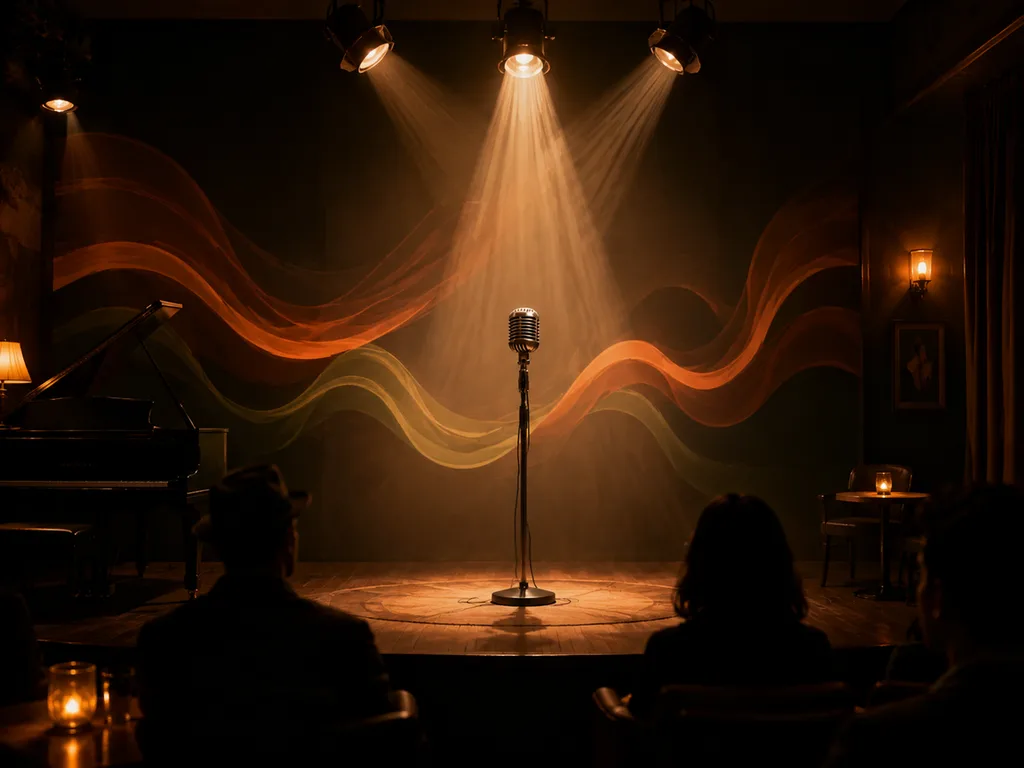
音楽・イベントのポスター
AIに最も自由度を与えられるフォーマットです。優れた音楽ポスターは、 literal な描写よりも雰囲気を重視します——霧に包まれたステージ、抽象的なサウンドウェーブ、シルエットに切り取られた観客など。
プロンプトのパターン:「小さなクラブでのインディーロックの夜のポスター、ムーディーな深紅と黒のパレット、リソグラフ印刷のようなザラついたテクスチャ、上部に大胆なヘッドラインエリア、下部に日付と会場のブロック」。日付や会場はモデルに生成させず、自分で追加するほうが賢明です——AIが生成する小さなテキストは崩れやすく、しかもイベントの詳細情報は変わるものだからです。
<think>The user wants me to translate an article fragment from English to Japanese. It's about café, restaurant, and local business promotional posters. I need to keep all markdown, URLs, image paths, HTML tags, code blocks, and the brand name "GLMImage" exactly as-is. I should use natural, fluent Japanese.
Let me translate carefully:
- "Café, restaurant and local business promos" → カフェ・レストラン・地元ビジネスのプロモ
- "Local promo posters live or die on appetite appeal and price clarity." → 地元向けプロモポスターは、食欲をそそる魅力と価格の明確さで成败が決まります。
- "The image does the appetite; you do the price." → 画像は食欲を演出し、価格表示はあなたが担当します。
- "Try:" → 例えば:
- The prompt example needs to be translated but keeping it as a prompt/quote
- "promotional poster for a specialty coffee shop's new autumn menu, warm burnt-orange palette, latte with latte-art steam, generous blank space in lower third for offer text." → This is a prompt example. I should translate it but it's inside quotes as a prompt example. Let me translate it naturally.
- "That blank space is deliberate — it's where your offer goes." → この空白部分は意図的なもので、オファー内容を入れるスペースです。
Let me write out the full translation:</think>
カフェ・レストラン・地元ビジネスのプロモ
地元向けプロモポスターは、食欲をそそる魅力と価格の明確さで成败が決まります。画像は食欲を演出し、価格表示はあなたが担当します。例えば:「特別なコーヒーショップの新しい秋メニュー向けプロモーションポスター、温かみのあるバーントオレンジの配色、ラテアートの湯気が立つラテ下部にオファー用の広めの余白」。この空白部分は意図的に設けられたもので、オファー内容を入れるスペースです。

<think>The user wants me to translate a fragment of an article into natural, fluent Japanese. Let me carefully follow all the rules:
- Keep ALL markdown syntax intact
- Keep every URL, image path, and HTML tag EXACTLY as-is
- Keep code blocks and inline code untranslated
- Keep "GLMImage" untranslated
- Use native, fluent expression
- Output ONLY the translated markdown
Let me translate the content:
Product launches and campaign posters
- 「Product launches and campaign posters」= 「製品発表とキャンペーン用ポスター」
The poster is the campaign's visual anchor: one hero image, one line, one date. Generate the hero with the product placed dramatically — center or rule-of-thirds — and keep 40% of the frame as clean space for the campaign line. For the product itself, start from a real photo with the AI product photography workflow, then build the poster composition around it.
Translation:
- 「The poster is the campaign's visual anchor」= 「ポスターはキャンペーンの視覚的な中心であり」
- 「one hero image, one line, one date」= 「1つのヒーロー画像、1つのコピー、1つの日付」
- 「Generate the hero with the product placed dramatically」= 「製品をドラマチックに配置したヒーロー画像を生成し」
- 「center or rule-of-thirds」= 「中央配置または三分割法を用いて」
- 「keep 40% of the frame as clean space for the campaign line」= 「キャンペーンのコピー用にフレームの40%を余白として確保します」
- 「For the product itself, start from a real photo with the [AI product photography workflow]」= 「製品自体については、[AI製品写真ワークフロー]で実際の写真から始め」
- 「then build the poster composition around it」= 「その後、その写真を中心にポスターの構図を構築してください」
Let me refine for natural Japanese:
製品発表とキャンペーン用ポスター
ポスターはキャンペーンの視覚的な柱となる存在です。ヒーロー画像1点、コピー1行、日付1つというシンプルな構成で考えます。ヒーロー画像を生成する際は、製品をドラマチックに配置しましょう。中央配置または三分割法を用い、キャンペーンのコピー用にフレーム全体の40%を余白として確保します。製品画像については、AI製品写真のワークフローで実際の写真をベースにして作成し、その写真を中心にポスターの構図を作り上げていきます。
Let me check once more for naturalness and accuracy. I think this works well.</think>
製品発表とキャンペーン用ポスター
ポスターはキャンペーンの視覚的な柱であり、ヒーロー画像1点、コピー1行、日付1つというシンプルな構成で考えます。ヒーロー画像を生成する際は、製品をドラマチックに配置し、中央配置または三分割法を用います。キャンペーンのコピー用にフレーム全体の40%を余白として確保してください。製品画像については、まずAI製品写真のワークフローで実際の写真をベースにして作成し、その写真を中心にポスター全体の構図を作り上げていきます。
<think>The user wants me to translate a fragment of an article about AI poster design into natural, fluent Japanese. I need to:
- Keep all markdown syntax intact
- Keep URLs and image paths exactly as-is
- Keep code blocks untranslated (none here)
- Keep "GLMImage" untranslated
- Use natural Japanese expression
- Output only the translated markdown
Let me translate the content:
Typographic posters → タイポグラフィポスター
The text discusses pure type posters and how AI handles them. Let me translate naturally:
"Pure type posters — a single word or number treated as the image — are having a moment in interior and brand spaces."
→ 「純粋な文字で構成されたポスター——1つの単語や数字を画像として扱うもの——が、インテリアやブランドの空間でいま注目されています。」
"AI handles these well when you describe the lettering as shape, not content:"
→ 「AIは、文字を内容ではなく形状として描写する際にうまく処理します:」
The quoted prompt description:
"bold condensed letterforms filling the frame, ink-black on off-white, subtle paper texture, slight baseline shift for hand-set feel."
→ 「フレームいっぱいに配置された太字のコンデンス体の字形、生成り色の紙地に墨黒、繊細な紙のテクスチャ、手組みの質感を出すためのわずかなベースラインシフト」
"Then replace with real type in your editor if the wording must be exact."
→ 「もし文言を正確にしなければならない場合は、エディター上で実際のフォントに置き換えてください。」
Image alt text: "A bold typographic poster design" → 「大胆なタイポグラフィのポスターデザイン」
Let me finalize this translation.</think>
タイポグラフィポスター
純粋な文字だけで構成されたポスター——1つの単語や数字を画像として扱うもの——が、インテリアやブランド空間でいま脚光を浴びています。AIはこのようなポスターも、文字を内容ではなく形状として描写するとうまく処理してくれます:「フレーム全体に広がる太字のコンデンス体の字形、生成り色の紙地に墨黒で、繊細な紙の質感、手組みの雰囲気を出すためのわずかなベースラインシフト」。そして、もし文言を正確にしなければならない場合は、エディター上で実際のフォントに差し替えてください。
<think>The user wants me to translate this article fragment about poster prompts into natural, fluent Japanese. Let me go through each part carefully.
The content is about a "prompt skeleton" for creating posters with AI image generation. Let me translate it naturally while keeping all markdown syntax intact.
Key points:
- Keep markdown formatting (headings, bold, lists)
- Keep "GLMImage" untranslated (though it's not in this fragment)
- Natural Japanese expression
- No preamble
Let me translate:
The prompt skeleton that works for posters
→ ポスターに使えるプロンプトの骨組み
Every strong poster prompt slots into the same five parts:
→ 優れたポスター用プロンプトは、すべて同じ5つの要素で構成されています。
-
Format — "vertical poster, A2 proportion" to lock the frame.
→ 1. フォーマット — 「縦長ポスター、A2比率」のように、構図を固定します。 -
Scenario — the event, product or message.
→ 2. シナリオ — イベント、製品、メッセージなど。 -
Palette and mood — two colors plus one texture word ("risograph grain", "glossy", "matte").
→ 3. 配色とムード — 色2色と質感を示す言葉を1つ(「リソグラフの粒感」「光沢あり」「マット」など)。 -
Composition — where the headline zone and the detail zone sit.
→ 4. 構図 — 見出し領域と詳細領域の配置。 -
Exclusions — "no photographs of real people, no small readable text."
→ 5. 除外指定 — 「実在人物の写真を含めない、判読可能な小さな文字は入れない」。
That last line matters more than people expect. Small generated text is where posters die in review.
→ この最後の項目は、想像以上に重要です。小さく生成された文字が原因で、レビュー段階でポスターが没になることがよくあります。
Let me refine this for natural Japanese flow.</think>
ポスターに使えるプロンプトの骨組み
優れたポスター用プロンプトは、すべて同じ5つの要素で構成されています。
- フォーマット — 「縦長ポスター、A2比率」のように指定して、構図を固定します。
- シナリオ — イベント、製品、メッセージなどの主題。
- 配色とムード — 色2色と質感を示す言葉を1つ(「リソグラフの粒感」「光沢あり」「マット」など)。
- 構図 — 見出しエリアと詳細エリアをどこに配置するか。
- 除外指定 — 「実在人物の写真を含めない、判読できる小さな文字は入れない」。
この最後の項目は、想像以上に重要です。小さく生成されたテキストが原因で、レビュー段階でポスターが没になることは少なくありません。
<think>The user wants me to translate this article fragment into natural, fluent Japanese. Let me carefully translate it while keeping all markdown syntax intact. There are no URLs, image paths, or HTML tags to preserve. No code blocks either. Just regular prose.
Let me translate:
Layout rules worth keeping
Headline contrast should survive a grayscale test — convert to gray; if the headline stops popping, the contrast was color-only. Keep one alignment system: everything on a grid, or deliberately off it, never both. And respect the reading triangle most cultures scan: headline, image, details, top to bottom.
For anything going to print, ask for the composition at the target ratio and leave 3–5mm bleed mentally — AI output at poster ratio crops fine at A3/A2 sizes for short-run prints.
Japanese translation:
残すべきレイアウトのルール
見出しのコントラストはグレースケールテストに耐えるべきである — グレーに変換して、見出しの印象が弱まるなら、それは色に依存したコントラストだ。配置システムは一貫させる — すべてをグリッドに沿わせるか、意図的に崩すか、そのどちらか一方に徹し、両方を混在させてはならない。そして、多くの文化で視線が流れる「読みの三角形」を大切にする — 見出し、画像、詳細、上から下へ。
印刷物にするときは、目標比率での構図を依頼し、3〜5mm の塗り足しを頭の中で確保しておく — ポスター比率での AI 出力は、少部数の印刷であれば A3/A2 サイズにきれいにクロップできる。
Let me refine this translation for naturalness and fluency:
- "Headline contrast should survive a grayscale test" → 見出しのコントラストはグレースケールテストに耐えるものでなければならない
- "if the headline stops popping" → もし見出しのインパクトが失われるなら
- "the contrast was color-only" → そのコントラストは色に頼ったものだったということだ
- "Keep one alignment system" → 配置システムは一つに統一する
- "everything on a grid, or deliberately off it" → すべてをグリッドに揃えるか、意図的にグリッドから外すか
- "never both" → 両方を同時にやってはいけない
- "respect the reading triangle most cultures scan" → 多くの文化で読み手が視線を動かす「読みの三角形」を尊重する
- "top to bottom" → 上から下へ
- "For anything going to print" → 印刷するものは
- "ask for the composition at the target ratio" → 目標の比率での構図を依頼する
- "leave 3–5mm bleed mentally" → 頭の中で3〜5mmの塗り足しを想定しておく
- "AI output at poster ratio crops fine at A3/A2 sizes" → ポスター比率で出力されたAI画像はA3/A2サイズにうまくクロップできる
- "for short-run prints" → 小部数の印刷では
Let me write the final version with proper Japanese fluency.</think>
残しておくべきレイアウトのルール
見出しのコントラストはグレースケールテストをクリアできるものでなければならない —— グレーに変換してみて、見出しの迫力が失われるなら、そのコントラストは色だけに依存していたことになる。配置のルールは一貫させること。すべてをグリッドに揃えるか、意図的に崩すか、そのどちらかに徹し、両方を混在させてはならない。また、多くの文化で視線が流れる「読みの三角形」—— 見出し、画像、詳細を上から下へ —— を尊重する。
印刷するものについては、目標比率での構図を依頼し、頭に 3〜5mm の塗り足し(ブリード)を想定しておくこと。ポスター比率で出力された AI 画像であれば、少部数の印刷では A3 / A2 サイズにきれいにクロップできる。
<think>The user wants me to translate an English article fragment about GLMImage into natural Japanese. Let me carefully translate this while keeping all markdown syntax, URLs, and brand names intact.
Let me analyze the text:
- It's about translating a poster concept into a full campaign
- Mentions Instagram post ideas and infographic guides
- Has two markdown links that must be preserved exactly
- Should be fluent Japanese
Let me translate:
"From poster to full campaign" → 「ポスターからフルキャンペーンへ」
"A poster rarely ships alone." → 「ポスターが単独で公開されることはほとんどありません。」
"The same prompt language extends to Instagram crops and story formats" → 「同じプロンプトの表現は、Instagramのクロップやストーリーのフォーマットにも展開できます」
"the Instagram post ideas guide covers adapting one visual system across feed, carousel and story." → 「Instagramの投稿アイデアガイドでは、フィード、カルーセル、ストーリーにわたって一つのビジュアルシステムを適応させる方法を解説しています。」
"When the campaign needs to explain rather than tease — data, process, comparison — that's infographic territory" → 「キャンペーンがティーザーでなく説明を必要とする場合 ― データ、プロセス、比較など ― それはインフォグラフィック領域の話になります」
"and the infographic walkthrough picks up from there." → 「そしてインフォグラフィックの解説がそこから受け継いで詳しく説明しています。」
Let me refine to make it more natural Japanese:
ポスターからフルキャンペーンへ
ポスターが単独で公開されることはほとんどありません。同じプロンプトの表現は、Instagramのクロップやストーリーのフォーマットにも展開できます。Instagram投稿アイデアガイドでは、フィード、カルーセル、ストーリーにわたって一つのビジュアルシステムを適応させる方法を解説しています。キャンペーンがティーズではなく説明を必要とする場合 ― データ、プロセス、比較など ― それはインフォグラフィック領域の話になります。インフォグラフィックの解説記事がそこからさらに詳しく紹介しています。
Let me check once more for fluency and naturalness:
- "ships alone" - 単独で公開される or 一つだけ公開される
- "prompt language" - プロンプトの表現 or プロンプト言語 - プロンプト言語 might be more literal but プロンプトの表現 is more natural
- "crops" - クロップ is okay in design context, but 切り抜き might be more natural Japanese. However, "Instagram crops" is a specific technical term, so クロップ or サイズ違い is fine
- "extends to" - 展開できる or 応用できる
- "covers adapting" - 解説している or カバーしている
- "tease" - ティーザー (using katakana is common in marketing)
- "territory" - 領域 is good
- "picks up from there" - そこから受け継ぐ or そこからさらに説明
Let me finalize the translation to be natural and fluent Japanese.</think>
ポスターからフルキャンペーンへ
ポスターが単独で公開されることはほとんどありません。同じプロンプトの表現は、Instagramのクロップやストーリーのフォーマットにも応用できます。Instagramの投稿アイデアガイドでは、フィード、カルーセル、ストーリーを横断して一つのビジュアルシステムを適応させる方法を解説しています。キャンペーンがティーザーでなく説明を求める場合 ― データ、プロセス、比較など ― それはインフォグラフィック領域の出番です。インフォグラフィック作成ガイドがそこからさらに詳しく解説しています。
<think>The user wants me to translate a blog fragment about working with an AI poster generator into natural Japanese. Let me translate this carefully while maintaining all markdown syntax, URLs, and the brand name "GLMImage".
Let me translate this:
Working with an AI poster generator, step by step
→ AIポスター生成ツールの使い方:ステップバイステップ
-
Write the one-line brief: event, audience, feeling.
→ 1行のブリーフを書く:イベント、ターゲット層、雰囲気。 -
Generate 6–8 compositions; judge only thumbnails at first pass.
→ 6〜8パターンの構図を生成。最初の選考はサムネイルだけで行う。 -
Pick two, refine the palette and headline zone in follow-up prompts.
→ 2つを選び、フォローアップのプロンプトで配色と見出しの領域を調整する。 -
Add real text for anything under 24pt — dates, venues, prices, URLs.
→ 24pt未満のすべての要素——日時、会場、料金、URL——には実際のテキストを追加する。 -
Export at the largest size, keep the layered source for future edits.
→ 最大のサイズでエクスポートし、レイヤー構造のソースファイルは将来の編集のために保管しておく。
Try the AI poster generator → — the headline lettering renders in both English and Chinese, which is still rare among generators.
→ AIポスター生成ツールを試す → — 見出しの文字は英語と中国語の両方でレンダリングされますが、この両言語対応は他の生成ツールにはまだあまり見られません。
Let me refine this to make it more natural and fluent in Japanese.</think>
AIポスター生成ツールの使い方:ステップバイステップ
- 1行のブリーフを書く:イベント、ターゲット層、雰囲気。
- 6〜8パターンの構図を生成。最初の選考はサムネイルだけで行う。
- 2つを選び、フォローアップのプロンプトで配色と見出しの領域を調整する。
- 24pt未満のすべての要素——日時、会場、料金、URL——には実際のテキストを追加する。
- 最大のサイズでエクスポートし、レイヤー構造のソースファイルは将来の編集のために保管しておく。
AIポスター生成ツールを試す → — 見出しの文字は英語と中国語の両方でレンダリングされますが、この両言語対応は他の生成ツールにはまだあまり見られません。
<think>The user wants me to translate an FAQ section about AI posters from English to Japanese. I need to keep all markdown syntax, URLs, brand names, and code intact while providing a natural Japanese translation.
Let me translate each FAQ entry carefully:
- "Can AI posters render text correctly?" - AIポスターはテキストを正しくレンダリングできますか?
- "What resolution do I need for printing?" - 印刷にはどの解像度が必要ですか?
- "How do I keep a consistent style across a poster series?" - ポスターシリーズ全体で一貫したスタイルを保つにはどうすればよいですか?
- "Are AI posters okay for commercial use?" - AIポスターは商用利用しても大丈夫ですか?
- "What if the layout ignores my composition instructions?" - レイアウトが構成指示を無視する場合はどうすればいいですか?
Let me translate each answer carefully while keeping the natural Japanese tone.</think>
よくある質問
AIポスターはテキストを正しくレンダリングできますか?
見出しサイズのテキストであれば、通常は可能です — 現代のモデルは一般的なフォントの短い表示テキストを扱えますし、中国語のヘッドラインレンダリングはGLM-imageクラスのモデルが本領を発揮する分野です。段落テキストや細部の文字は苦手なので、エディタで追加してください。
印刷にはどのくらいの解像度が必要ですか?
A3サイズで150dpiの場合、およそ2480×3508px必要です。生成は利用可能な最大サイズで行い、必要に応じてアップスケールしてください。少部数のデジタルプリントはAI出力でも十分許容範囲ですが、美術用のジクレー印刷にはやや厳しいでしょう。
ポスターシリーズ全体で一貫したスタイルを保つにはどうすればよいですか?
まったく同じプロンプトの骨格を再利用し、主題の行だけを変更してください。パレットに関する言葉や質感を表す言葉の一貫性は、シリーズの一体感のために他のどの要素よりも効きます。
AIポスターは商用利用しても大丈夫ですか?
当プラットフォームでは、有料プランで生成されたポスターには透かしが入らず、商用利用する権利もお客様に帰属します。第三者の商標、実在する有名人の肖像、存命中のアーティストの作風に酷似したスタイルは避けてください。
レイアウトが構図の指示を無視する場合はどうすればいいですか?
指示が競合するとモデルは迷います。構図の要望を最初に、かつ一つだけ記載してください — 「上三分の一に見出しゾーン」と書くほうが、「上に見出し、左下にロゴ、右にバッジ」と書くより効果的です。