<think>The user wants me to translate this English article fragment into natural, fluent Japanese. Let me work through this carefully.
The article is about "Vintage Scientific Illustration" - it's a guide about the style of scientific illustrations from the 18th and 19th centuries. I need to translate it completely while keeping all markdown syntax intact.
Let me translate each part:
- "Vintage Scientific Illustration: Gallery and Prompt Guide" → "ビンテージ科学イラスト:ギャラリーとプロンプトガイド"
- The introduction paragraph needs to be translated naturally into Japanese
Let me think about the best Japanese expressions:
- "plate style" → "図版様式" or "プレート様式"
- "engraved or etched subject" → "彫版またはエッチングによる主題"
- "fine hatching" → "細かいハッチング"
- "sepia or otherwise limited palette" → "セピア色またはそれに類する限定された色調"
- "copperplate italics" → "銅板イタリック体"
- "hairline leader lines" → "細線の引出線"
- "printing limits of the era" → "その時代の印刷技術の限界"
- "signals care" → "丁寧さを伝える"
- "a reader sees a well-made plate" → "読者は丁寧に作られた図版を見る"
- "the subject was studied slowly" → "主題が丹念に研究されたと推測する"
For the rest:
- "This guide covers" → "本ガイドでは〜を解説する"
- "what defines the vintage scientific illustration look" → "ビンテージ科学イラストの外観を定義づけるもの"
- "a gallery of example plates" → "見本図版のギャラリー"
- "the prompt patterns that reproduce the style with GLMImage" → "GLMImageでスタイルを再現するプロンプトパターン"
- "where the style fits modern work" → "現代の制作現場におけるこのスタイルの位置づけ"
Let me put it together naturally in Japanese.</think>
ビンテージ科学イラスト:ギャラリーとプロンプトガイド
ビンテージ科学イラストとは、18世紀から19世紀にかけて主流だった図版様式のことです。細かいハッチングで表現された彫版またはエッチングによる主題、セピア色をはじめとした限定的な色調、そして銅板イタリック体で組まれたラベルと、それを結ぶ細線の引出線によって構成されます。この様式は当時の印刷技術の制約から生まれましたが、今もなお受け継がれています。丁寧に作られた図版を目にした読者は、主題が丹念に研究されたのだと自然に感じるからです。本ガイドでは、ビンテージ科学イラストの外観を定義づける要素、見本図版のギャラリー、GLMImageでこのスタイルを再現するためのプロンプトパターン、そして現代の制作現場におけるこのスタイルの位置づけについて解説します。
<think>The user wants me to translate a blog fragment about vintage scientific illustration style into Japanese. I need to:
- Keep all markdown syntax intact
- Keep URLs and HTML tags exactly as-is
- Keep code blocks untranslated (there are none here)
- Keep "GLMImage" untranslated (not in this fragment)
- Use native, fluent Japanese
- Output only the translated markdown
Let me translate this carefully:
-
"What defines the vintage scientific illustration style?" → ヴィンテージ科学挿絵のスタイルを特徴づけるものは何か?
-
"Four traits do most of the work, and all four trace back to how plates were actually printed." → 主に4つの特徴がそれを成し遂げており、いずれも実際の版の印刷方法に由来しています。
-
"Engraving line." → 彫刻線
-
"Copperplate engraving and etching build tone with fine, even, parallel hatching, because presses of the era could not reproduce continuous tone cheaply." → 銅版画の彫刻とエッチングは、時代の印刷機では連続階調を安価に再現できなかったため、細く均一な平行ハッチングで調子を表現します。
-
"Crosshatching goes darker; single hatching stays light." → 交差ハッチングはより暗くなり、単一ハッチングは明るさを保ちます。
-
"No airbrush, no gradients — the line pattern is the shading." → エアブラシも、グラデーションも一切ありません — 線の模様そのものが陰影なのです。
-
"A limited, aged palette." → 限定された、古びた色彩
-
"Sepia and iron-gall ink tones on cream or slightly foxed paper, sometimes one muted hand-tinted accent — a watercolor-thin green on a fern, a wash of ochre on a beetle's shell." → クリーム色またはわずかに褐色がかった紙の上に、セピアや鉄インクのトーンを用い、時には控えめな手彩色による差し色が添えられます — シダには水彩のように薄い緑、甲虫の殻には黄土色の washes。
-
"Copperplate labels." → 銅版のラベル
-
"Titles in engraved serif capitals, part labels in italic script, connected to the subject by hairline leader lines." → タイトルは彫刻されたセリフ体の大文字、部位ラベルはイタリック体の筆記体で、被写体とは極細の引出線で結ばれています。
-
"The lettering is cut into the plate like everything else, so it reads as part of the artwork, not stamped on afterward." → 文字も他の要素と同様に版に直接彫られているため、後から押印されたものではなく、作品の一部として読まれます。
-
"Composed symmetry." → 構図の対称性
-
"The subject sits centered with generous margins, often framed by a decorative rule or border that presents the plate like a document." → 被写体は中央に配置され、十分な余白が取られ、しばしば装飾的な罫線や枠で囲まれて、版を文書のように見せています。
-
"The layout says reference plate, not snapshot." → そのレイアウトはスナップショットではなく、参考図版であることを示しています。
-
"Our longer piece on what natural history illustration is covers how these plates documented ecosystems and processes; the short version is that the style and the science grew up together, which is why the look still reads as trustworthy." → 博物学挿絵とは何かについての詳細な記事でも、これらの図版がどのように生態系やプロセスを記録してきたかを扱っています。簡単に言えば、スタイルと科学は共に発展してきたため、その外観は今でも信頼性を感じさせるのです。
-
"For the full historical treatment, see the natural history vintage illustration guide." → 歴史的な詳細については、博物学ビンテージ挿絵ガイドをご覧ください。
Let me refine the Japanese to be more natural and fluent. I'll keep the structure intact and preserve the bold formatting for the four traits.
Let me make sure I preserve all markdown formatting:
- The heading "## What defines the vintage scientific illustration style?" should become "## ヴィンテージ科学挿絵のスタイルを特徴づけるものは何か?"
- Bold text: Engraving line. etc. should be preserved
- Italic: is should be preserved with asterisks
- Links: text should be preserved exactly with URLs
Let me refine once more for naturalness:
"Engraving line." - The Japanese should be concise. 雕刻の線 or 雕刻線 or 銅版彫刻の線. I'll go with 銅版の彫刻線.
Actually, looking again, the structure uses bold for the trait names. I'll keep them concise:
- Engraving line. → 彫刻による線描
- A limited, aged palette. → 限定された古びた色彩
- Copperplate labels. → 銅版彫刻のラベル
- Composed symmetry. → 構図の対称性
Let me finalize the translation:
ヴィンテージ科学挿絵のスタイルを特徴づけるものは何か?
主に4つの特徴がそれを実現しており、そのすべてが実際の版面の印刷方法に由来しています。
彫刻による線描。 銅版の彫刻とエッチングは、当時の印刷機では連続階調を安価に再現できなかったため、細く均一な平行ハッチングで調子を構築します。交差ハッチングはより暗くなり、単一のハッチングは明るさを保ちます。エアブラシも、グラデーションもありません — 線の模様そのものが陰影なのです。
限定された古びた色彩。 クリーム色やわずかに褐変した紙の上のセピア色や鉄インクのトーンに、時には控えめな手彩色の差し色が加わります — シには水彩のように薄い緑、甲虫の甲羅には黄土色の washes。
銅版彫刻のラベル。 タイトルは彫刻されたセリフ体の大文字、部位ラベルはイタリック体の筆記体で、被写体とは極細の引出線で結ばれています。文字も他の要素と同様に版に彫り込まれているため、後からスタンプされたものではなく、作品の一部として読み取れます。
構図の対称性。 被写体は十分な余白を伴って中央に配置され、しばしば装飾的な線や枠で囲まれて、版面が文書のように提示されます。このレイアウトは、スナップショットではなく参考図版であることを物語っています。
博物学挿絵とは何かに関する詳細な記事でも、これらの図版がどのように生態系やプロセスを記録してきたかを扱っています。手短に言えば、スタイルと科学は共に育まれたため、その見た目は今でも信頼できるものとして読めるのです。歴史的な全体像については、博物学ビンテージ挿絵ガイドをご覧ください。
I think this is good. Let me check once more for naturalness and accuracy.
"The short version is that the style and the science grew up together, which is why the look still reads as trustworthy." - "手短に言えば" is good but "簡単に言えば" might be more natural. Let me use that.
Also for "crosshatching" - 交差ハッチング is a bit technical. In Japanese illustration/art terminology, it's often クロスハッチング or 交差線. I'll keep 交差ハッチング as it's technical and clear.
For "foxed paper" - 褐変した紙 or 茶色いシミのある紙. 褐変 is more technical/art conservation appropriate. I'll keep it.
For "wash of ochre" - 黄土色の washes. In Japanese, "wash" can be kept or translated as 淡彩 or 薄い重ね塗り. I'll keep "washes" or use 淡彩.
Actually, let me reconsider "washes" - it's an art term meaning a thin transparent layer of paint. I'll translate it as 淡い washes or just keep washes in italics perhaps. Actually, since we're translating into Japanese, I should translate it. "薄い washes" with the original English word in italics could work, or just 淡彩.
Let me finalize. I think the translation is good. Let me output it.</think>
ヴィンテージ科学挿絵のスタイルを特徴づけるものは何か?
主に4つの特徴がそれを実現しており、そのすべてが実際の版面の印刷方法に由来しています。
彫刻による線描。 銅版の彫刻とエッチングは、当時の印刷機では連続階調を安価に再現できなかったため、細く均一な平行ハッチングで調子を構築します。交差ハッチングはより暗くなり、単一のハッチングは明るさを保ちます。エアブラシも、グラデーションもありません — 線の模様そのものが陰影なのです。
限定された古びた色彩。 クリーム色やわずかに褐変した紙の上のセピア色や鉄インクのトーンに、時には控えめな手彩色による差し色が加わります — シダには水彩のように薄い緑、甲虫の甲羅には黄土色の淡彩。
銅版彫刻のラベル。 タイトルは彫刻されたセリフ体の大文字、部位ラベルはイタリック体の筆記体で、被写体とは極細の引出線で結ばれています。文字も他の要素と同様に版に彫り込まれているため、後からスタンプされたものではなく、作品の一部として読み取れます。
構図の対称性。 被写体は十分な余白を伴って中央に配置され、しばしば装飾的な罫線や枠で囲まれて、版面が文書のように提示されます。このレイアウトは、スナップショットではなく参考図版であることを物語っています。
博物学挿絵とは何かに関する詳細な記事でも、これらの図版がどのように生態系やプロセスを記録してきたかを扱っています。簡単に言えば、スタイルと科学は共に育まれたため、その見た目は今もなお信頼できるものとして読み取れるのです。歴史的な全体像については、博物学ビンテージ挿絵ガイドをご覧ください。
<think>The user wants me to translate this article fragment about vintage scientific illustration into natural, fluent Japanese. I need to:
- Keep all markdown syntax intact (headings, lists, bold/italic, etc.)
- Keep URLs and image paths exactly as-is
- Keep HTML comments as-is (the IMG comments are HTML comments)
- Keep "GLMImage" untranslated
- Use natural, fluent Japanese
- Output only the translated markdown
Let me translate carefully:
- "Vintage scientific illustration gallery" → 古典科学挿絵ギャラリー or 古風な博物図版ギャラリー
- "Six plates that show the range of the style" → この様式の幅を示す6枚の図版
- "Each was produced with the prompt patterns in the next section" → それぞれ次のセクションのプロンプトパターンで生成された
- "and each pairs a subject with the labeling convention of its field" → そして各図版は主題と、その分野の標記慣例を組み合わせている
Let me think about some technical terms:
- "Ecosystem plate" → 生態系図版
- "natural-history composition" → 博物学的構図
- "producers, consumers, decomposers" → 生産者、消費者、分解者
- "tableaux" → タブロー
- "Process plate" → プロセス図版
- "water cycle" → 水循環
- "evaporation, condensation, precipitation, runoff" → 蒸発、凝縮、降水、流出
- "Geological cross-section" → 地質学的断面図
- "strata plates" → 地層図版
- "Zoological anatomy plate" → 動物解剖図版
- "forewing, hindwing, antennae, body segments" → 前翅、後翅、触角、体節
- "entomological folios" → 昆虫学の大判本
- "Specimen engraving" → 標本版画
- "crosshatched line" → クロスハッチングの線
- "Latin name in copperplate script" → 銅版彫刻体のラテン語名
- "binomial names" → 二名法名
- "diagnostic silhouette" → 識別用の輪郭
- "Botanical plate with detail study" → 細部研究付き植物図版
- "magnified seed case" → 拡大された種子殻
- "dissected flower" → 解剖された花
- "habit drawing" → 全体習性図
- "detail insets" → 細部挿入図
- "identification characters" → 同定形質
- "densest information-per-square-inch layout" → 平方インチあたりの情報量が最も多いレイアウト
Let me write the full translation now. I'll aim for natural Japanese that reads well, with appropriate scientific terminology in Japanese.</think>
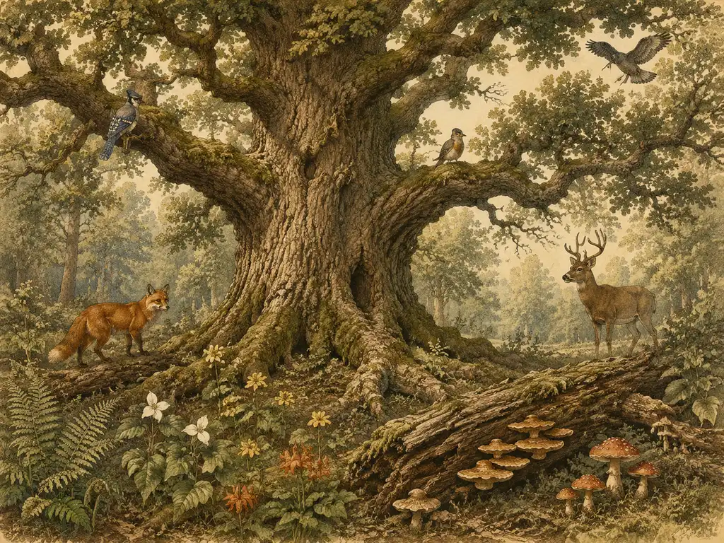
古風な博物図版ギャラリー
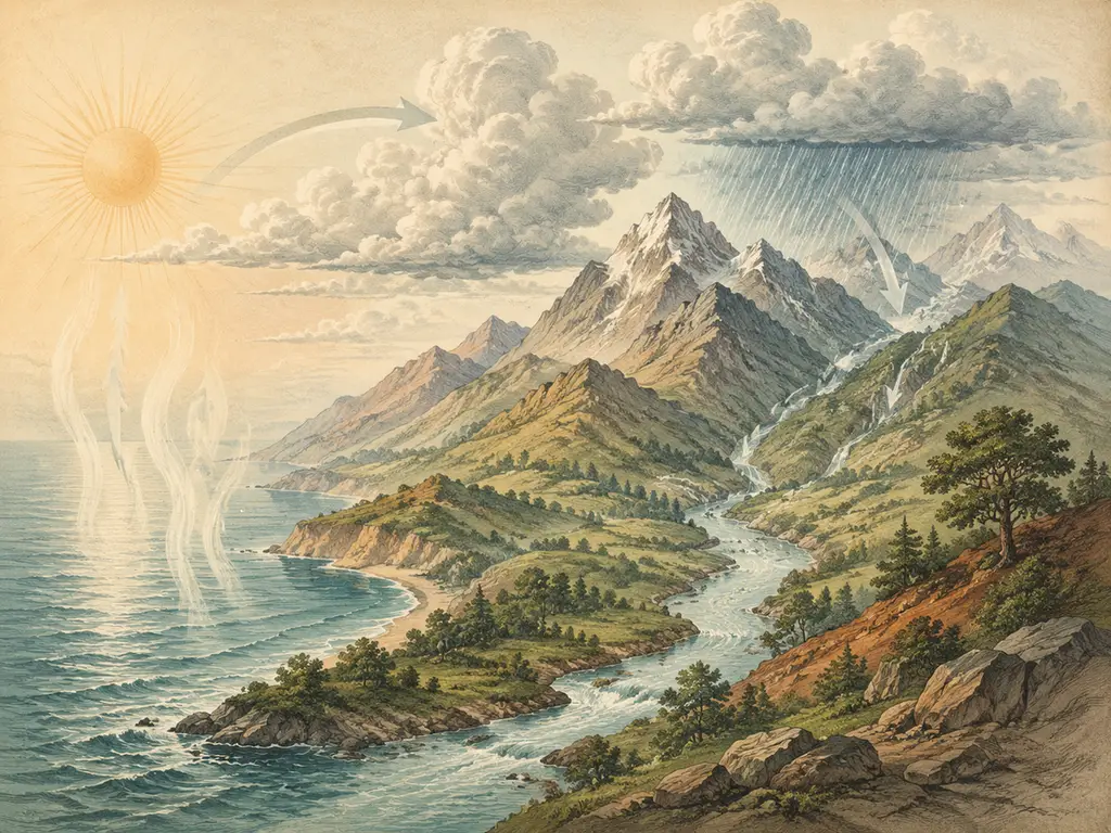
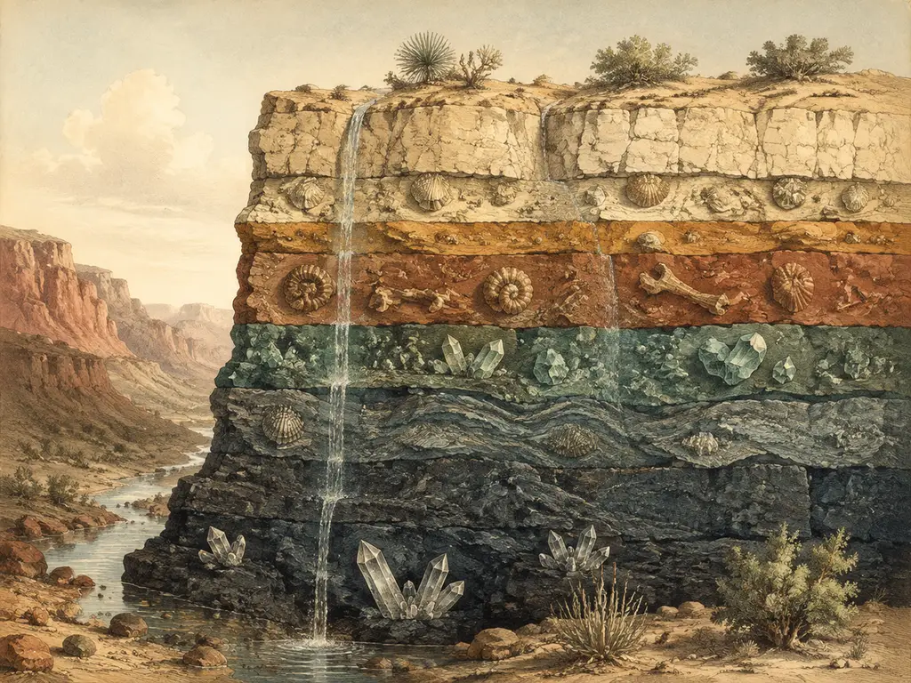
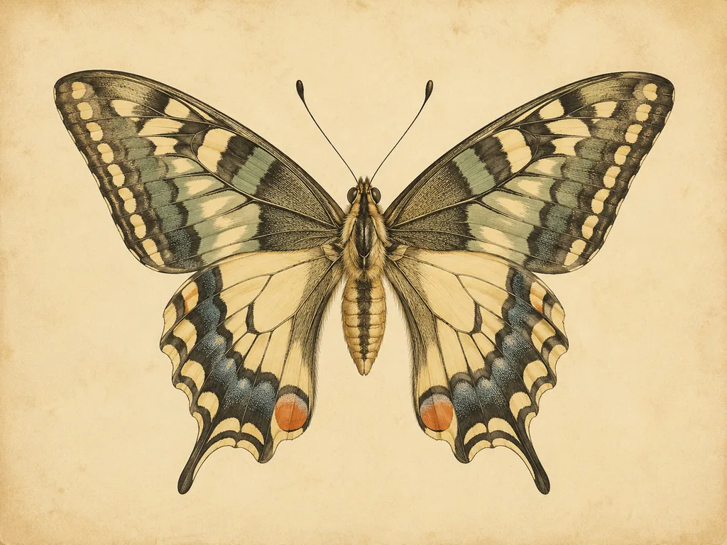
この様式の幅を示す6枚の図版。いずれも次のセクションのプロンプトパターンで生成されたもので、それぞれ主題とその分野の標記慣例を組み合わせている。
1. 生態系図版。 古典的な博物学的構図——生産者、消費者、分解者を一画面に配置し、エネルギーの関係がひと目で読み取れるようにしたもの。古風な図版では、これらを構成されたタブローとして扱っていた。すべての生物が自然に散らばるのではなく、明瞭に配置されている。
2. プロセス図版:水循環。 循環図は当時の定番だった。図版なら一画面で全段階——蒸発、凝縮、降水、流出——を一度に示せるからだ。写真は決してこうはいかない。矢印とラベルが論理を運ぶ。
3. 地質学的断面図。 地層図版は古い順に積み重なった岩層を、時代の名前を側面に振り分けて示す。この様式——層状の帯、極細の境界線、数字付きの余白——は今日の地質図でもほぼそのまま受け継がれている。使われている活字がすっきりしただけだ。
4. 動物解剖図版。 診断形質となる部位に名を付けた単独標本。下のチョウの翅図版では、前翅、後翅、触角、体節にラベルが振られている。これが偉大な昆虫学大判本の様式であり、1種につき1葉、翅を広げた姿で描かれる。
5. 標本版画。 古風な図版の中でも最も静かな部類。クロスハッチングで描かれた一羽の鳥または一頭の哺乳類、後ろに栖息地を示唆する風景、下に銅版彫刻体のイタリック体でラテン語名。図解はなく、仔細な観察だけがある。これらの単独標本図版が一つの仕事を完璧にこなすがゆえに長く生き残ってきた——二名法名が生物を特定し、姿勢が識別の輪郭を示し、それ以外の何ものも注意を奪わない。現代のフィールドガイドもほぼ形を変えずにこの様式を借りている。
<!--IMG: 19th-century copperplate engraving of a heron wading in marsh grass, fine crosshatching, sepia tones, italic serif labels — vintage scientific illustration plate-->
6. 細部研究付き植物図版。 植物図版の慣例は、植物全体と下端の解剖図を組み合わせる——拡大された種子殻、解剖された花——それぞれに小さなラベルが付く。一葉に二つの縮尺の記録が同居する。習性図はその種がどこに育ち、どういう姿勢で立っているかを示し、細部挿入図は写真では埋もれてしまう同定形質を担う。古風な伝統の中で平方インチあたりの情報量が最も多いレイアウトであり、背後に本物の構造がなければ模倣するのは最も難しい。
<!--IMG: vintage botanical plate of a fern frond with a magnified sori detail inset, engraving hatching, aged cream paper, italic serif labels-->
<think>The user wants me to translate an article fragment into natural, fluent Japanese. Let me carefully translate this while keeping all markdown syntax, URLs, image paths, HTML tags, and the brand "GLMImage" intact.
Let me translate the content:
The article is about how to prompt vintage scientific illustration with GLMImage. Let me work through it carefully.
Key points to maintain:
- All markdown syntax (bold, etc.)
- URLs exactly as-is
- HTML tags exactly as-is
- Brand "GLMImage" untranslated
- Natural, fluent Japanese
- Complete translation, no summarization
Let me draft the translation:
GLMImageでビンテージ科学イラストをプロンプトする方法
機能するパターン:時代 + 技法 + 部位を含む被写体 + 明示的なラベル + パレット + 仕上げ。 どれか一つでも欠けると、モデルは見当違いになり、たいていモダンなフラットスタイルを推測してしまいます。
scientific illustration generatorですぐに使える具体的なプロンプト:
- 「19世紀の銅板版画によるヒマワリの図。舌状花、筒状花、茎、葉を示す;各部位をイタリックセリフ体でラベル付け;細かい平行ハッチング、セピア調のトーン、使い込まれたクリーム色の紙」
- 「ビンテージ動物学図版:沼地の草の中に立つサギ、交差ハッチングによる版画、羽には控えめな水彩の着色、すべての見える部位にラベル、ラテン名を銅板スクリプト体で下に配置」
- 「アンティーク地質学図版:最も古いものから新しいものへの地層断面図、各層にその時代の名前をラベル、セピアインク、細い引き出し線、細い罫線による縁取り」
- 「18世紀の人体の心臓の解剖図版、断面図、心腔と弁をイタリックセリフ体でラベル、モノクロインク、使い込まれた紙の上、交差ハッチングによるトーン」
- 「ビンテージ天文学図版:円形に配置された月の満ち欠け、版画による線画、各フェーズを銅板イタリックでラベル、クリーム色の背景」
ヒット率を上げるいくつかの習慣があります。ラベルを明示的に指定してください — モデルは指定したものを、概ね指定した順でラベル付けします。技法の言葉は線の質を変えます:「銅板版画(コパープレート・エングレービング)」「エッチング」「リトグラフ」はそれぞれ異なる痕跡を生み出し、「スティップル」は点描版画のドット調のトーンになります。インクだけでなく紙も指定してください — 「使い込まれたクリーム色の紙」や「端に茶色いシミ(フォクシング)」でパレット全体が落ち着きます。そして判断する前に2、3バリエーション生成してください;最初の図版が最もよく構成されたものであることは稀です。基礎となるプロンプトの構造については、scientific illustration prompt guideが公式をフィールドごとに分解しています。
すべてのツールを越えて生き残る一つのルール:使用する前に検証する。ビンテージスタイルは装飾に過ぎません;正確さは比率、関係、ラベルに宿る。微妙に間違ったラベルを持つ美しい図版は、このスタイルにおけるAI生成の古典的な失敗パターンであり、それはまさしく1850年と同じくらい危険です。
Let me review this carefully:
- All markdown is preserved (##, **, -, etc.)
- URLs are intact: /generators/scientific-illustrations, /blog/scientific-illustration-prompts-guide
- HTML tags - there don't appear to be any in this fragment beyond the URLs in markdown link syntax
- "GLMImage" is kept
- The translation sounds natural Japanese
Let me refine some parts to make them more natural:
- "ヒット率を上げるいくつかの習慣があります" - good
- "標本" might be better than "被写体" for "subject" in this context
- Actually "被写体" is fine
Let me double check the terms:
- copperplate engraving = 銅板版画 or 銅版彫刻 - I used 銅板版画 which is a common Japanese term
- ray florets = 舌状花
- disk florets = 筒状花
- stipple = 点描 or スティップル - I used both
- foxing = フォクシング (the technical term)
Actually, looking at "foxing at the edges" - this refers to the brown spots/aging on old paper. I translated it as "茶色いシミ(フォクシング)" which is reasonable.
Let me also reconsider some stylistic choices. The original text uses bold for emphasis on certain terms, which I should preserve.
Looking at "era + technique + subject with its parts + explicit labels + palette + finishing." - this is bolded in the original. In my translation I kept it bold.
Let me also reconsider:
- "sciart" or scientific illustration - 科学イラスト (which I used)
- "specimen" or "subject" - 被写体
Actually I want to refine "18th-century anatomical engraving of a human heart in section" - I translated as "18世紀の人体の心臓の解剖図版、断面図" but the "in section" refers to showing the cross-section view. So perhaps "18世紀の人体心臓の解剖版画、断面図で" would be more accurate.
Let me make a final pass:
The translation looks good. Let me finalize it.</think>
GLMImageでビンテージ科学イラストをプロンプトする方法
機能するパターン:時代 + 技法 + 部位を含む被写体 + 明示的なラベル + パレット + 仕上げ。 どれか一つでも欠けると、モデルは推測に頼ることになり、推測するのはたいていモダンなフラットスタイルです。
scientific illustration generatorでそのまま使える具体的なプロンプト:
- 「19世紀の銅板版画によるヒマワリの図。舌状花、筒状花、茎、葉を示す;各部位をイタリック体のセリフでラベル付け;細かい平行ハッチング、セピア調のトーン、使い込まれたクリーム色の用紙」
- 「ビンテージ動物学図版:沼地の草の中に立つサギ、交差ハッチングの版画、羽には控えめな水彩の着色、すべての見える部位にラベル、ラテン名を銅板スクリプト体で下に配置」
- 「アンティーク地質学図版:最も古いものから新しいものへの地層断面図、各層にその時代の名前をラベル、セピアインク、細い引出し線、細い罫線の枠」
- 「18世紀の人体心臓の解剖版画、断面図、心腔と弁をイタリック体のセリフでラベル、モノクロインク、使い込まれた用紙の上、交差ハッチングによる調子」
- 「ビンテージ天文学図版:円形に配置された月の満ち欠け、版画による線画、各フェーズを銅板イタリックでラベル、クリーム色の背景」
ヒット率を上げるいくつかの習慣があります。ラベルを明示的に指定してください — モデルは、記載したものを概ね記載した順にラベル付けします。技法の言葉は線の質を変えます。「銅板版画(copperplate engraving)」「エッチング」「リトグラフ」はそれぞれ異なる痕跡を生み出し、「スティップル(stipple)」は点描版画特有のドット調の調子を与えてくれます。インクだけでなく用紙も指定してください — 「使い込まれたクリーム色の用紙」や「縁のフォクシング(経年による茶色い染み)」でパレット全体が地に足のついたものになります。そして判断する前に2〜3バリエーションを生成してください;最初の図版が最もよく構成されたものであることは稀です。基礎となるプロンプトの構造については、scientific illustration prompt guideがフィールドごとに公式を分解しています。
あらゆるツールを越えて生き残る一つのルール:使う前に検証する。ビンテージスタイルは装飾に過ぎません;正確さは比率、位置関係、ラベルに宿ります。微妙に間違ったラベルが付いた美しい図版は、このスタイルにおけるAI生成の典型的な失敗パターンであり、それはまさしく1850年の時点とまったく同じく危険です。
<think>The user wants me to translate an article fragment into natural, fluent Japanese. Let me work through this carefully, maintaining all markdown syntax, URLs, code blocks, and the brand name "GLMImage" untranslated.
Let me translate this thoughtfully into Japanese:</think>
ビンテージな科学イラストが現在使われている場面
プリントとポスター。 最も一般的な商用利用です。額装された植物図鑑や解剖図の図版は安定して売れています。というのも、このスタイルはモダンなフラットデザインでは合わないようなインテリアにしっくりと馴染むからです。
編集・書籍デザイン。 サイエンスジャーナリズムやエッセイ集、書籍の本文デザインでは、職人的で真面目な印象を与えるために、写真を多用しない手法として engraving のルックが採用されています。セピア調の図版は長文テキストの隣に置いても自然に収まりますが、光沢のあるレンダーではめったにそうはいきません。図版は広告ではなく「遺物」として読まれるのです。
ブランディングとパッケージ。 茶葉缶、ハーブ系スピリッツ、薬局向け商品、コーヒー焙煎ブランドなどは、原料へのこだわりを示すためにセピア調の図版を採用しています。(商用利用する前に、生成した図版にライセンス上の問題がないか確認してください。GLMImage で生成した画像は、商用利用を含めご自由に使うことができます。)
教育とミュージアム。 フィールドガイド風の意匠や展示グラフィックもこのルックを取り入れています。19世紀のフォリオを開いたことがない読者にも、信頼性のあるものとして読めるからです。
率直な内訳としては、装飾的・編集的な用途ではスタイル再現こそがすべてであり、しっかりしたプロンプトがあれば十分です。教学や参考資料としての用途では、ビンテージの皮一枚の下に、現代の科学イラストと同水準の正確さが求められます。ラベルの確認、構造のカウント、関係の検証、いずれも欠かせません。
科学イラスト生成ツールをお試しください — 博物学モード、初回1枚無料
<think>The user wants me to translate this FAQ section about vintage scientific illustration into Japanese. I need to:
- Keep all markdown syntax intact
- Keep URLs, image paths, and HTML tags as-is
- Keep "GLMImage" untranslated
- Use native, fluent Japanese
- Translate completely - no summarization
Let me translate this carefully:
- "Why does vintage scientific illustration still look authoritative?" → なぜ古風な科学挿絵は現代でも権威的に見えるのか?
- The style came from a production constraint... → その様式は制作上の制約から生まれた...
- "Can AI reproduce the engraving style well?" → AIは engraving(版画)スタイルをうまく再現できるか?
- Note: "engraving" here is a style term - I should translate it naturally
- GLM-Image is mentioned - this should remain untranslated per rule 4 (it says "GLMImage" but the text has "GLM-Image")
- Wait, the rule says keep "GLMImage" untranslated. The text has "GLM-Image" which is a product name. I should keep it as-is.
- "What is the difference between vintage and modern scientific illustration?" → 古風と現代の科学挿絵の違いは何ですか?
- "Where can I see original vintage plates?" → オリジナルの古版プレートはどこで見られますか?
- Biodiversity Heritage Library - this is a proper name, keep as-is
Let me write this out in natural Japanese:
FAQ
なぜ古風な科学挿絵は現代でも権威的に見えるのか?
その様式は制作上の制約から生まれた ― 連続階調が印刷できなかったため線描 hachure(ハッチング)が用いられた ― そして制約は意図的なものと感じられる。細かく均一な線描と丁寧なラベル付けは、誰かがその対象をゆっくりと研究した証しであり、それはまさに科学図版が読者に与えたい印象そのものである。
AIは版画スタイルをうまく再現できるか?
はい ― ハッチング、セピア調の配色、構成されたレイアウトは確実に再現でき、文字量の多いラベルも美しく描画される。なぜなら GLM-Image には画像内テキスト用の専用 Glyph Encoder が搭載されており、CVTG-2K テキストレンダリングベンチマークで 91.16% の精度を達成しているからだ。注意すべきは様式ではなく科学的内容である。使用前にすべてのラベルや比率を必ず検証すること。
古風と現代の科学挿絵の違いは何ですか?
技法と配色の違いであり、目的は同じである。どちらも正確でラベリングされている必要がある。古風なものは版画のハッチングとセピア調を用いるが、現代的な作品はフラットカラー、クリーンなサンセリフ体のラベル、または 3D レンダリングを用いる。様式は装飾であり、正確性はどちらにおいても本質的な仕事である。
オリジナルの古版図版はどこで見られるか?
デジタル化されたコレクションが最も手軽なルートである。Biodiversity Heritage Library には博物学文献からスキャンされた何百万点もの図版が所蔵されており、大規模な博物館の図書館の多くにも閲覧可能なデジタル化されたフォリオがある。オリジナルの研究することは、できる限りの最高のプロンプト研究である。
Let me refine this for natural Japanese flow:
For "hatching" - this is a technical term. In Japanese, it's often written as ハッチング (katakana) or 線描. I'll use ハッチング as it's standard in design/illustration.
For "sepla palettes" → セピア調の配色 (sepia-tone palette)
For "continuous tone" → 連続階調 (continuous tone) - this is a printing term
For "engraving" as a style - I think I should just keep it descriptive or use 版画
Let me also reconsider "production constraint" → 制作上の制約 or 生産上の制約. The latter is more technical.
Let me check the URL/HTML rule - no URLs or HTML in this text, just the brand name GLM-Image (with hyphen) and "Biodiversity Heritage Library" which is a proper noun.
Actually, looking at the rule again: "Keep the brand word 'GLMImage' untranslated." - The text has "GLM-Image" which seems to be the same brand. I'll keep it as is.
Let me finalize the translation with natural Japanese flow:</think>
FAQ
なぜ古風な科学挿絵は現代でも権威的に見えるのか?
その様式は制作上の制約から生まれた ― 連続階調が印刷できなかったためハッチング(平行線描)が用いられた ― そして制約は意図的な行為のように読み取れる。細かく均一な線描と丁寧なラベル付けは、誰かがその対象を丹念に観察・研究したことを示しており、それはまさに科学図版が読者に伝えたい印象そのものである。
AIは版画スタイルをうまく再現できるか?
はい ― ハッチング、セピア調の配色、構成されたレイアウトは安定して再現でき、文字量の多いラベルも美しく描画される。GLM-Image には画像内テキスト専用の Glyph Encoder が搭載されており、CVTG-2K テキストレンダリングベンチマークで 91.16% を達成しているためである。注意すべきは様式ではなく科学的内容であり、使用前にはすべてのラベルや比率を必ず検証すること。
古風と現代の科学挿絵の違いは何ですか?
技法と配色の違いであって、用途の違いではない。どちらも正確でラベル付けされている必要がある。古風なものは版画のハッチングとセピア調を用い、現代的な作品はフラットカラー、すっきりしたサンセリフ体のラベル、あるいは 3D レンダリングを用いる。様式は装飾にすぎず、正確性こそが両者に共通する本質的な仕事である。
オリジナルの古版図版はどこで見られるか?
最も手軽なルートはデジタル化されたコレクションである。Biodiversity Heritage Library には博物学文献からスキャンされた何百万点もの図版が所蔵されており、主要な博物館の図書館のほとんどには閲覧可能なデジタル化フォリオが揃っている。原本を研究することは、プロンプト作成のための最良の事前調査である。
<think>The user wants me to translate an article fragment about natural history illustration into Japanese. Let me look at what's provided:
The fragment shows "## Sources" with a list of links and a reference to Biodiversity Heritage Library.
Wait, looking more carefully, the input only contains the "## Sources" section. The instructions say "This is ONE fragment of a longer article — translate it COMPLETELY; never summarize or shorten." But the only content I see is the sources section.
Let me translate what I have:
Sources
The list items:
- What is natural history illustration?
- Natural history vintage illustration guide
- Scientific illustration prompt guide
- Biodiversity Heritage Library — biodiversitylibrary.org
Translation:
出典
- 自然史イラストレーションとは?
- 自然史のヴィンテージイラストレーションガイド
- 科学イラストレーションのプロンプトガイド
- Biodiversity Heritage Library — biodiversitylibrary.org
I should keep URLs as-is. The brand "Biodiversity Heritage Library" - I should keep this untranslated as it's a proper name/organization. The em dash and URL should stay as-is.
Let me reconsider the translation to be more natural Japanese:
出典
- 自然史イラストレーションとは?
- 自然史のヴィンテージイラストガイド
- 科学イラストプロンプトガイド
- Biodiversity Heritage Library — biodiversitylibrary.org
This looks good. Since this is just the sources section, I'll translate it completely.</think>
出典
- 自然史イラストレーションとは?
- 自然史のヴィンテージイラストガイド
- 科学イラストプロンプトガイド
- Biodiversity Heritage Library — biodiversitylibrary.org